A redesign project that reinterprets a classic children’s story through updated color, illustration, and layout.
Project Concept
This project is a modern editorial redesign of Winnie-the-Pooh by A.A. Milne. The goal was to reimagine a classic children’s story while preserving its warmth, simplicity, and nostalgic charm. I wanted the redesign to feel fresh and contemporary, but still connected to the original story’s sense of wonder, innocence, and imagination.
The project focused on book cover design, interior layout, typography, color, and visual storytelling. Through multiple sketches and digital iterations, I explored how a familiar story could be transformed into a cohesive visual system.
Creative Direction
The creative direction began with one central question:
How can a classic story be redesigned for a modern audience without losing its original charm?
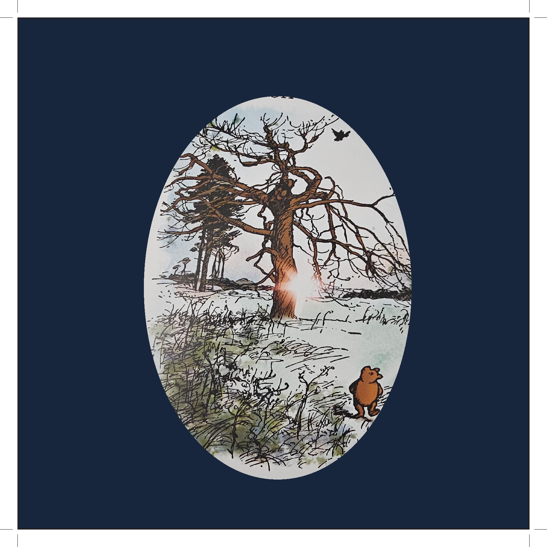
To answer this, I studied the story's tone and focused on Pooh’s curiosity, innocence, and quiet moments of reflection. One key passage that guided the project was Pooh sitting under the tree, thinking about the buzzing sound and realizing it must be connected to bees and honey.
This moment helped shape the book's emotional direction. The redesign needed to feel playful, warm, thoughtful, and imaginative.
Mood BOARD Exploration
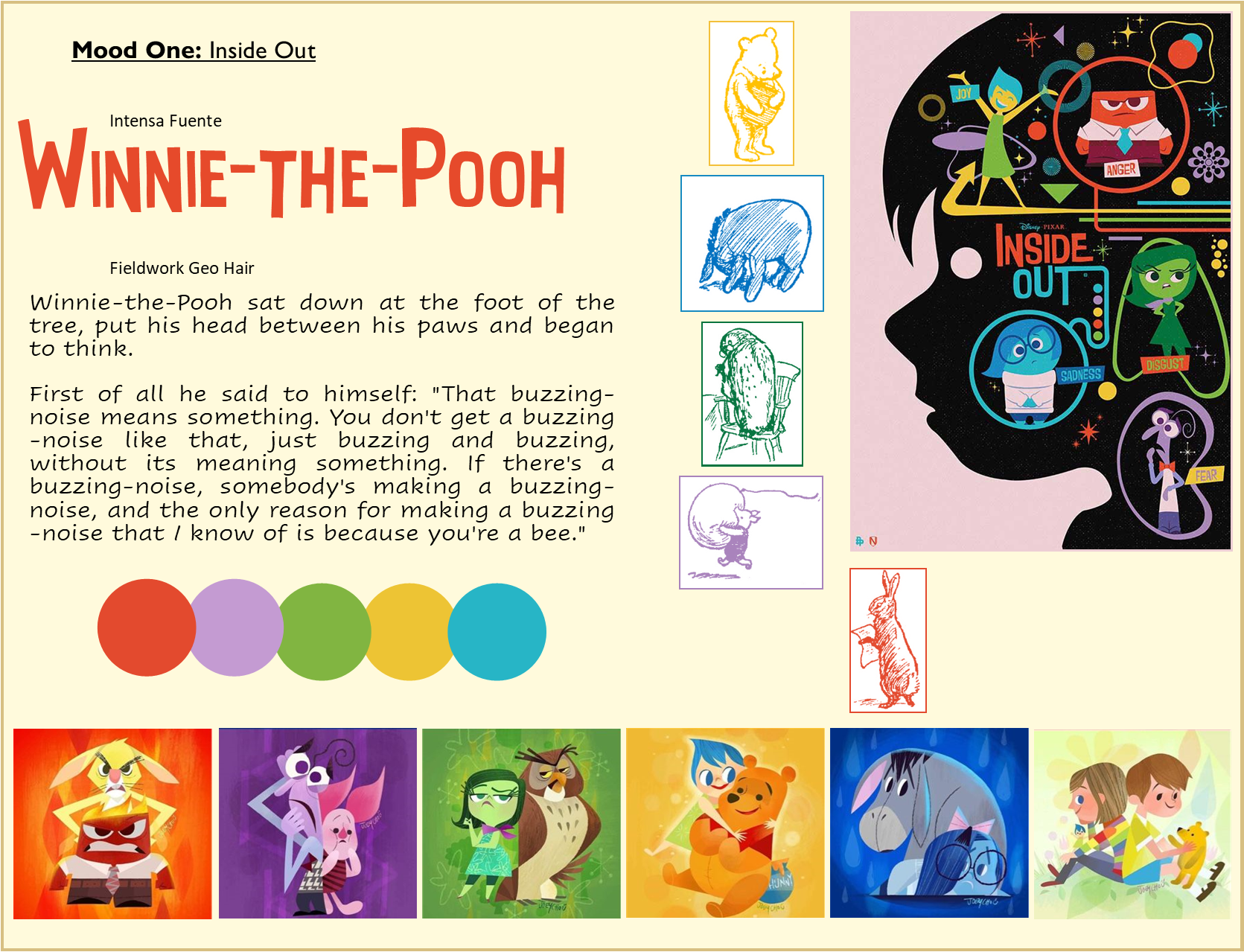
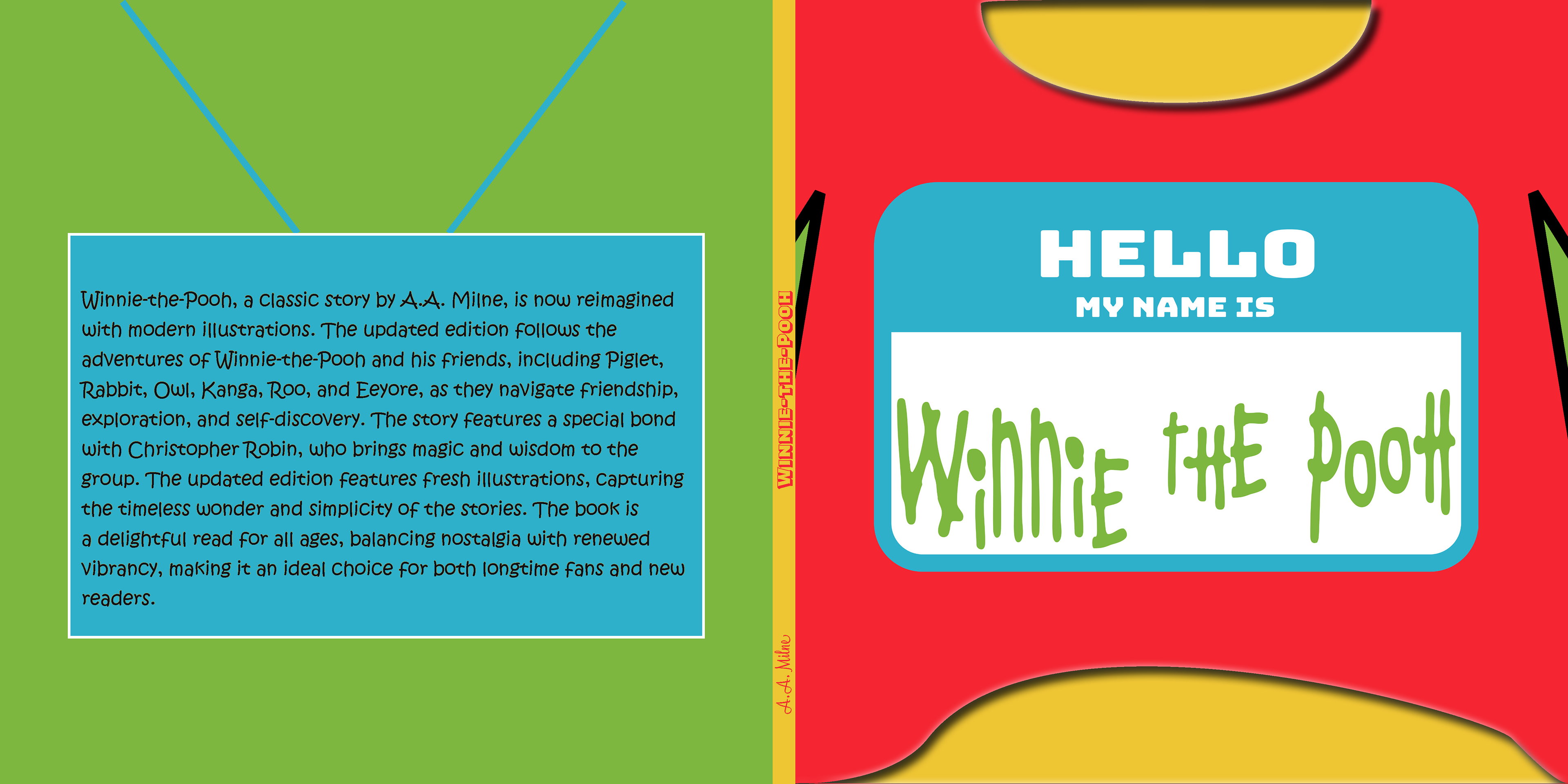
Mood One: Inside Out
The first mood direction was inspired by the emotional color language of Inside Out. This version focused on how Pooh feels internally rather than only showing where the story takes place.
I explored bright, saturated colors, playful typography, and character-driven visuals. This direction emphasized emotion, energy, and personality.
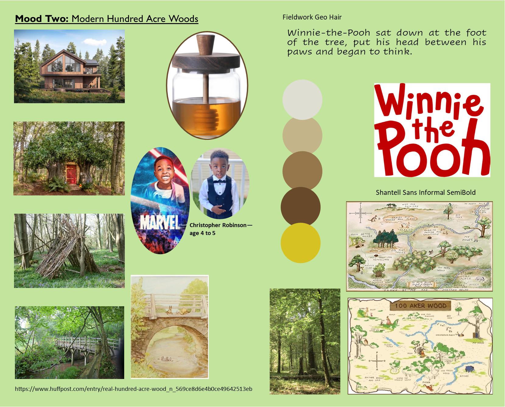
Mood Two: Modern Hundred Acre Woods
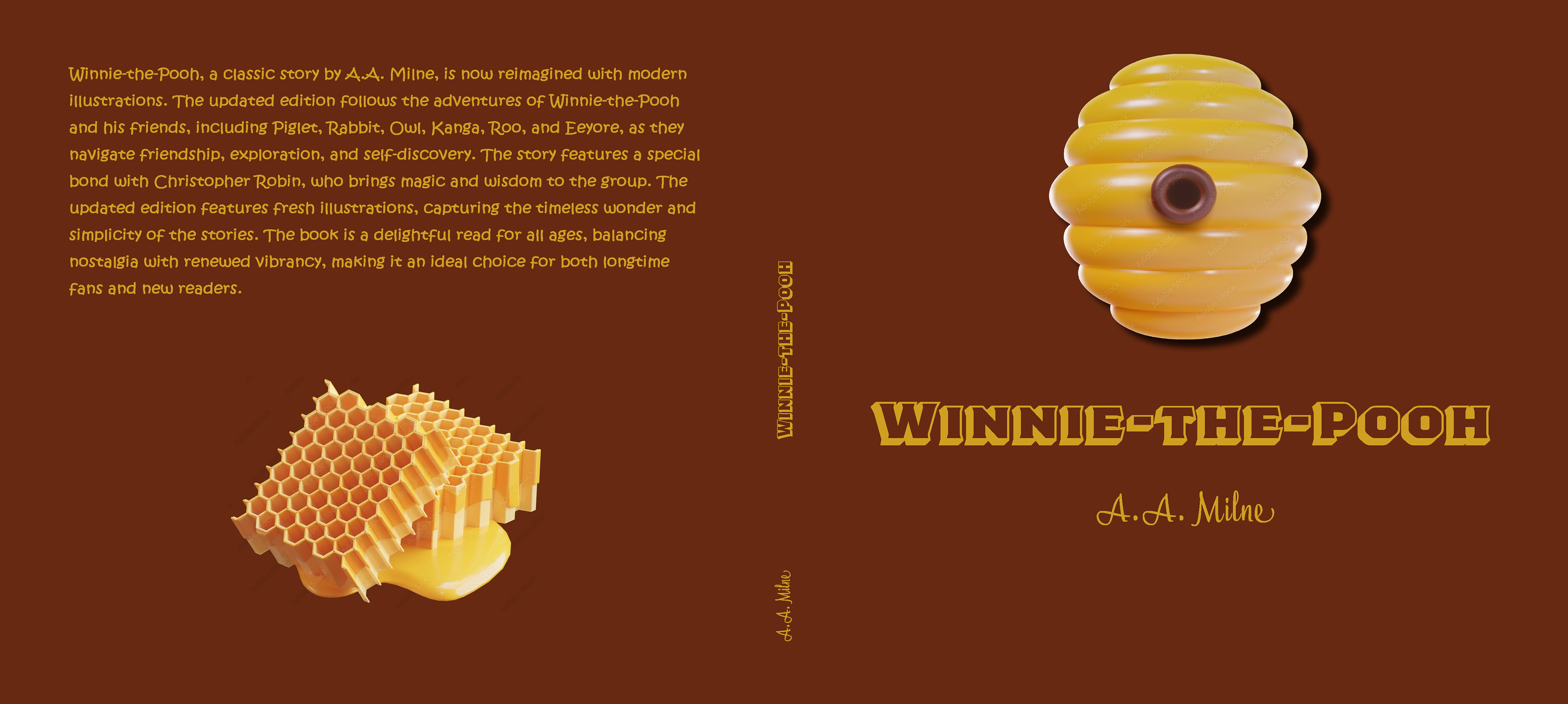
The second mood direction focused more on the environment and atmosphere. I explored forest photography, natural textures, warm earth tones, honey-inspired colors, and softer typography.
This version imagined the Hundred Acre Wood as a modern, lived-in place while still feeling connected to the original story.
Since Mood Board One explores the Disney side more, I ruled out this option due to copyright issues and focused on Mood Board Two.
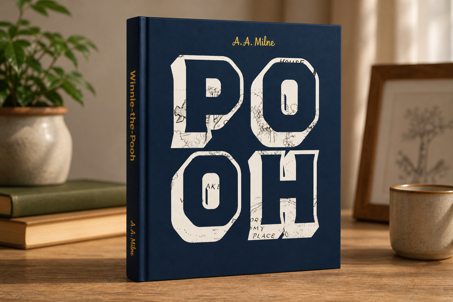
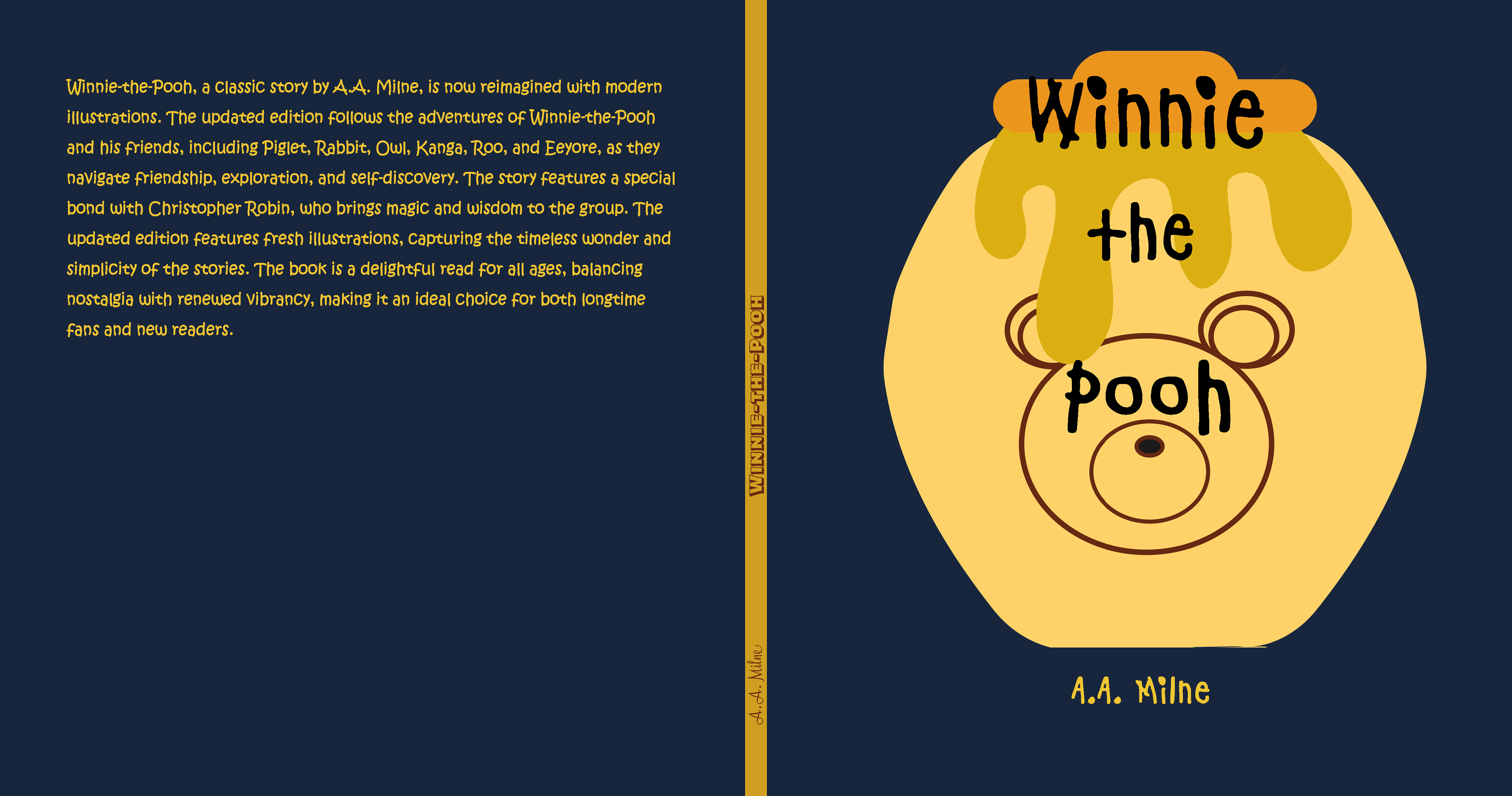
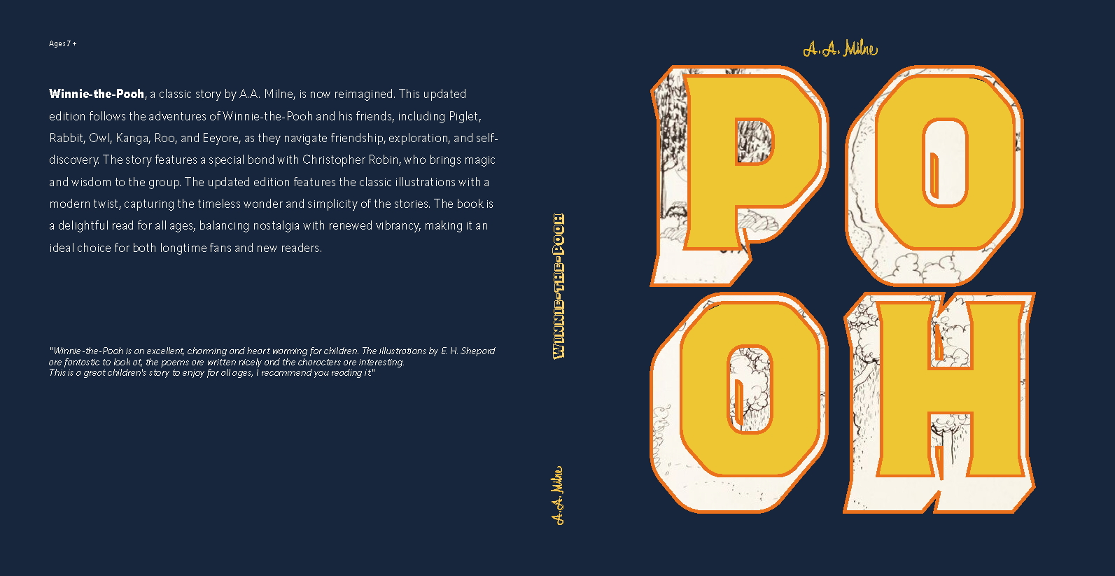
Cover Concept Development
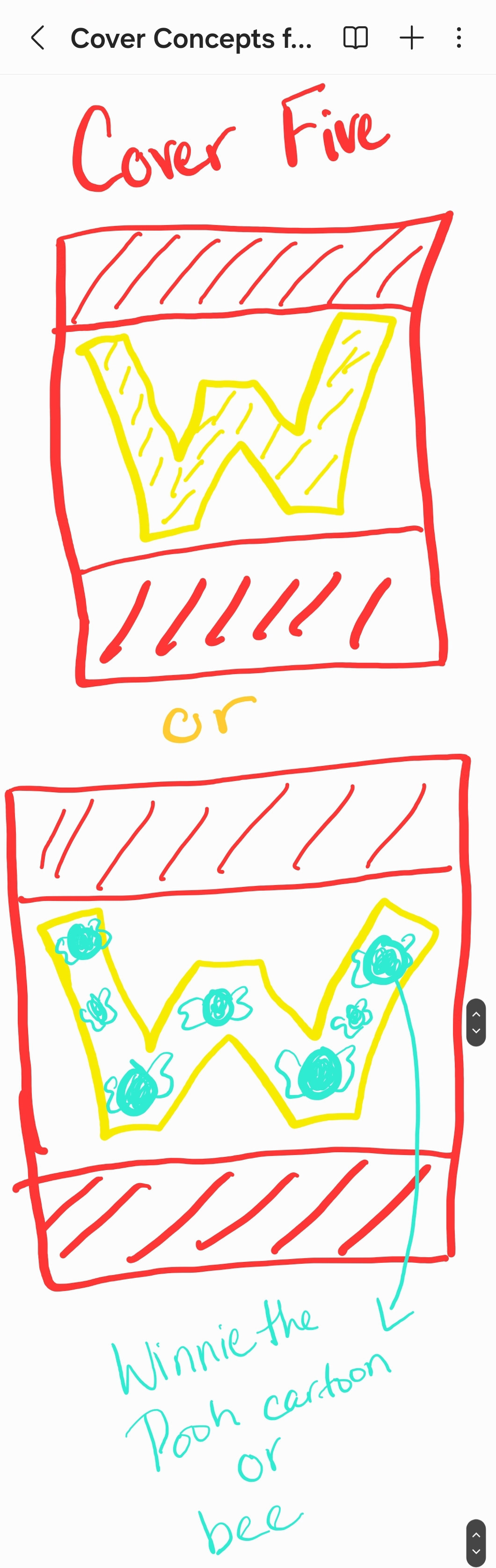
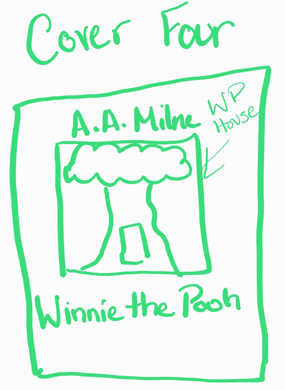
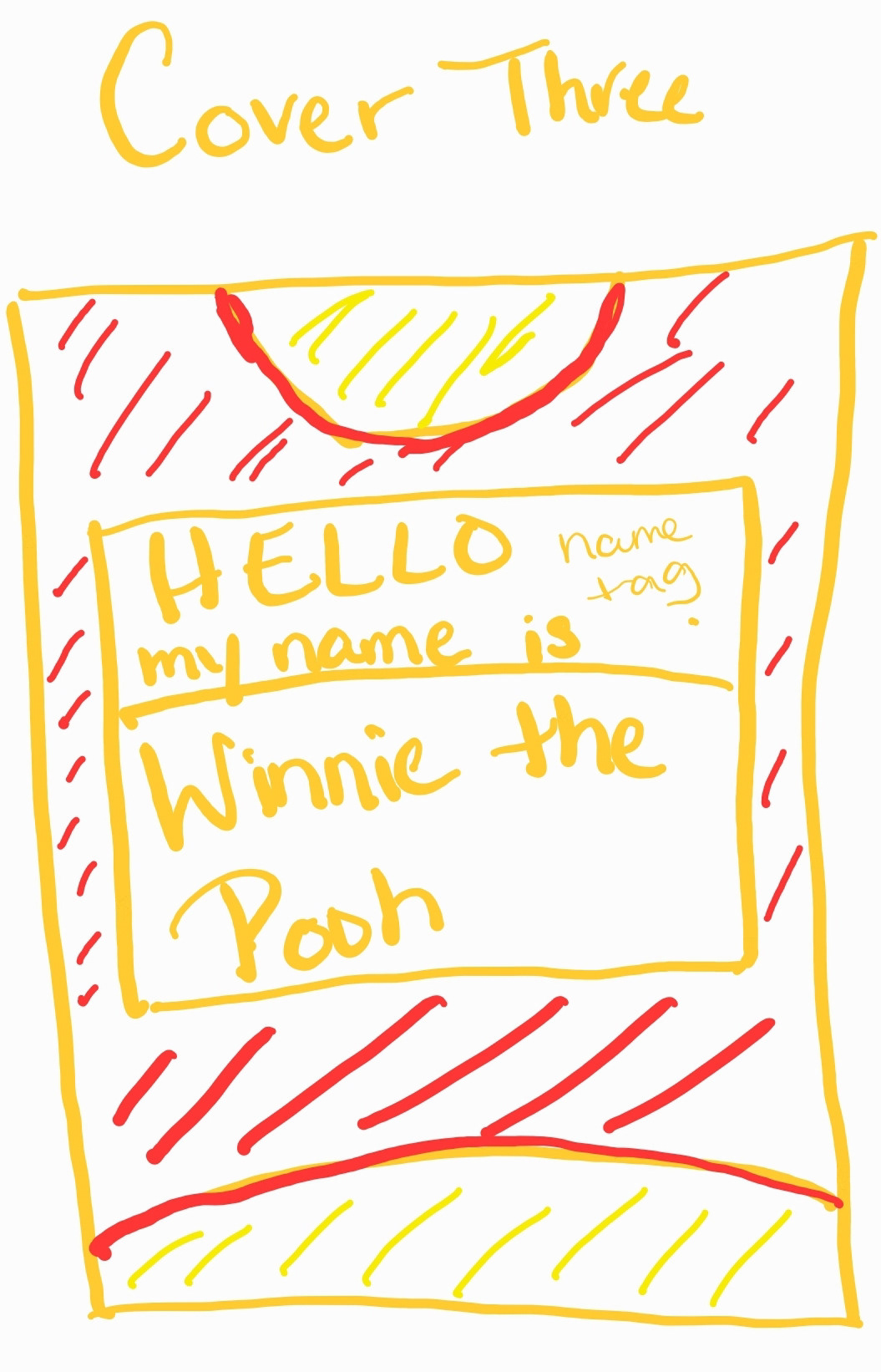
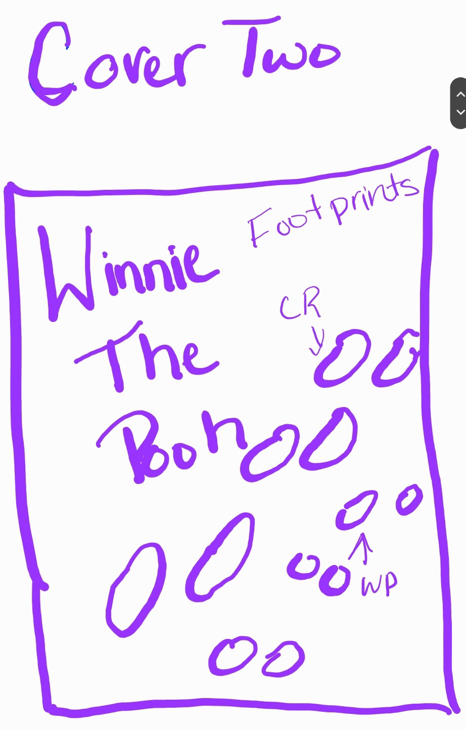
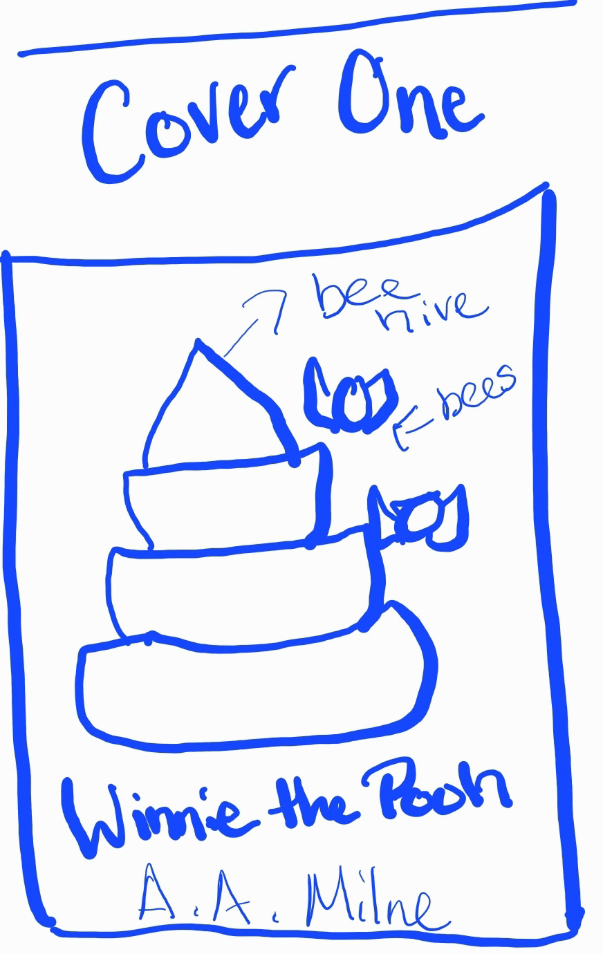
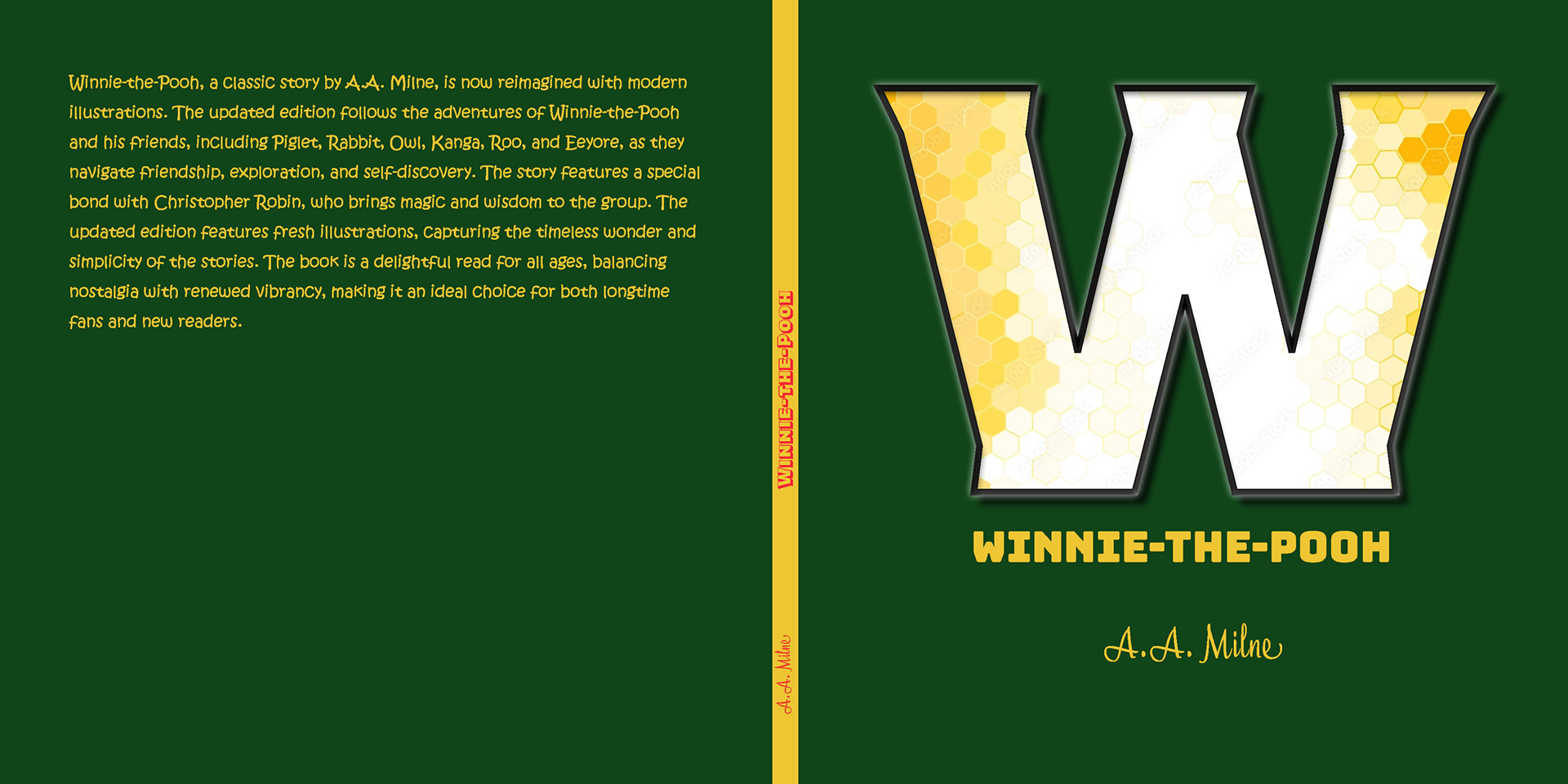
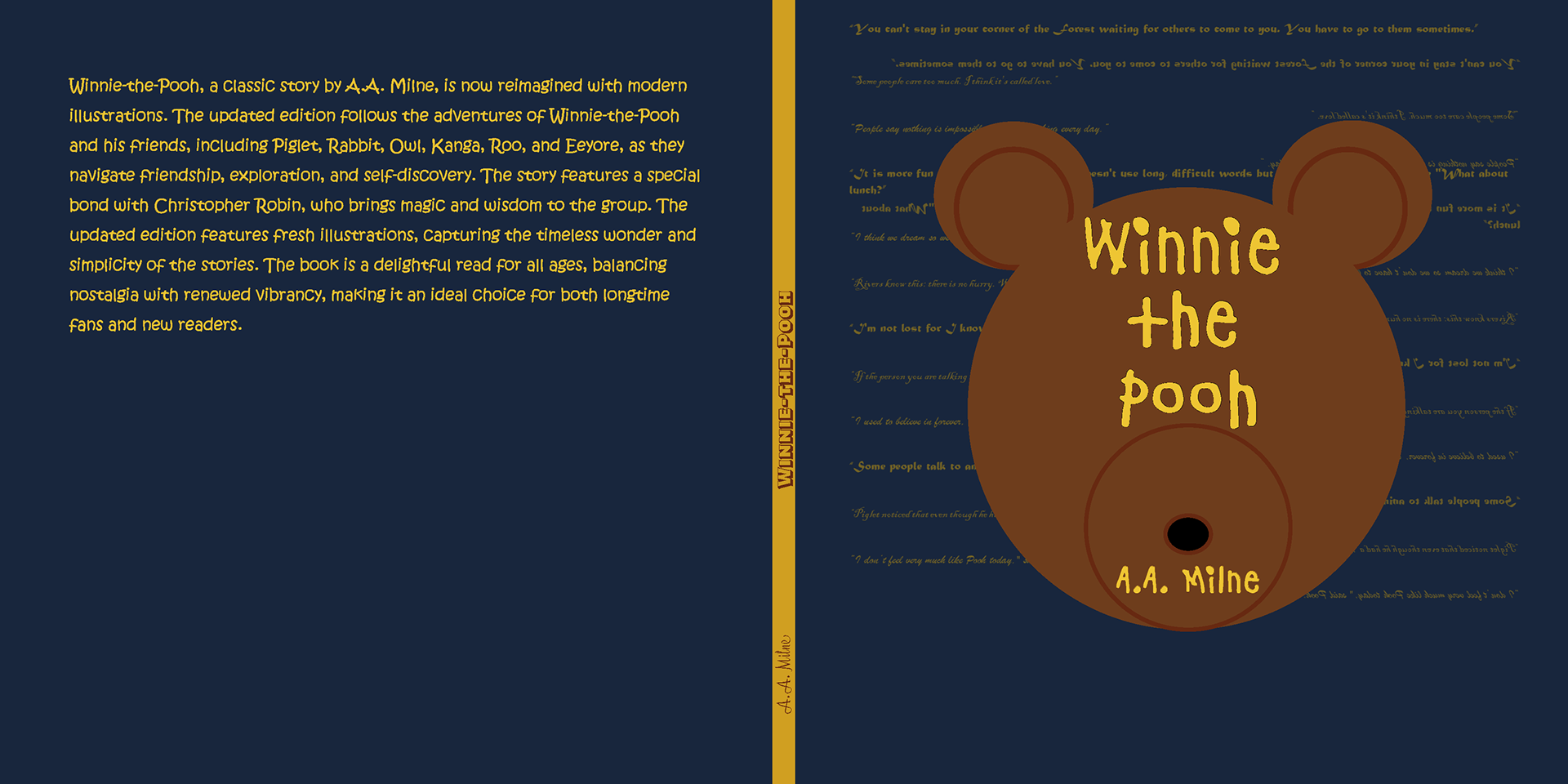
The cover design began with quick sketches to explore different ways of representing the story visually. I tested several concepts, including honey stacks, bees, footprints, Pooh’s house, and large typographic forms.
One of the strongest directions was using typography as the main image. Instead of relying solely on a character illustration, I explored how a letterform or title treatment could serve as the book's visual identity.
The early “W” concept eventually evolved into a stronger typographic system where the title itself became part of the storytelling.


Sketches & Early Ideas
The sketching phase allowed me to work quickly and freely before moving into digital design. These rough drawings helped me test hierarchy, composition, and symbolism.
The strongest ideas included:
- Honey and bees to reference Pooh’s motivation
- Footprints to suggest movement, discovery, and adventure
- Pooh’s house/tree to connect the design to the Hundred Acre Wood
- Large letters to turn typography into an image
This stage helped me move from literal storytelling to a more abstract and modern visual direction.
Digital Iterations
After sketching, I moved into digital design and created several versions of the book cover and interior pages. These early versions helped me test scale, typography, layout, and color.
Some early designs focused on playful imagery, while others explored bolder typography. As the project developed, the cover became more refined, and the interior pages became more consistent.
This process helped me understand how the cover and interior needed to work together as a single, cohesive book system.
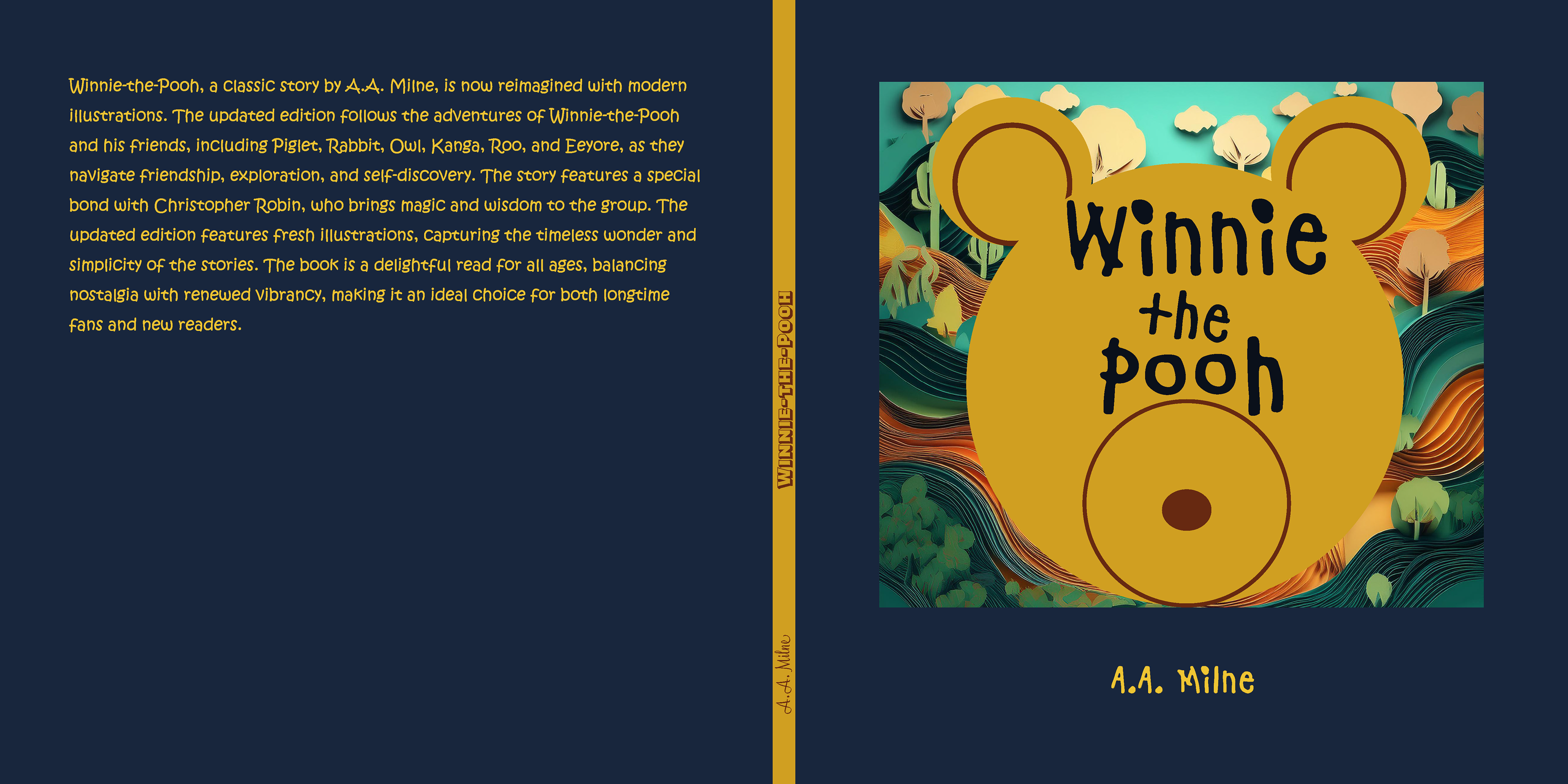
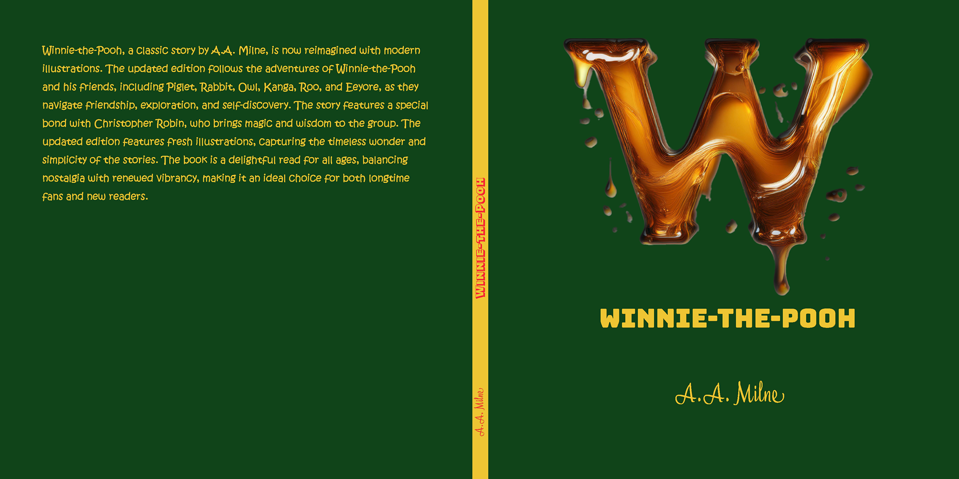
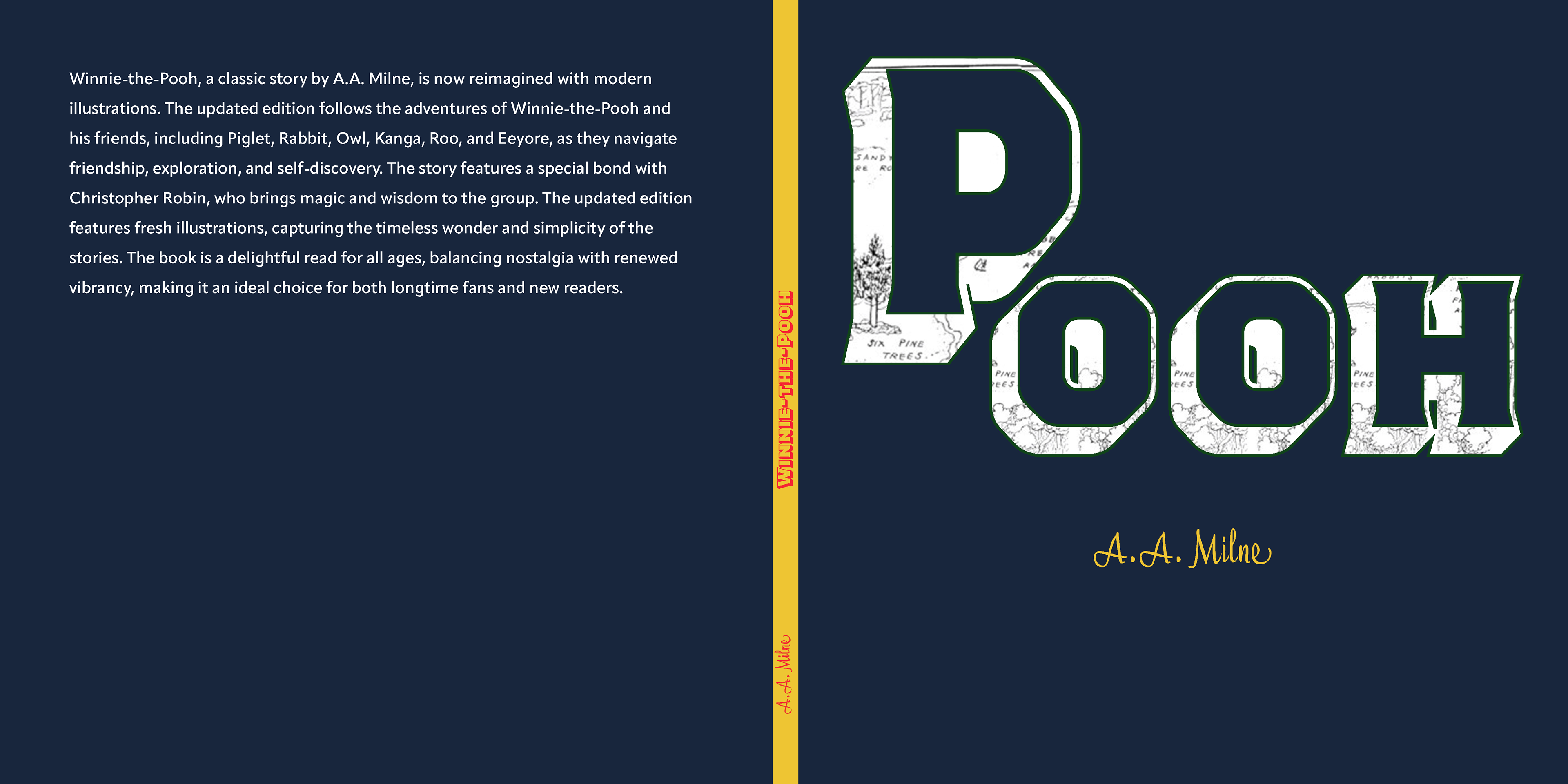

Typography as Storytelling
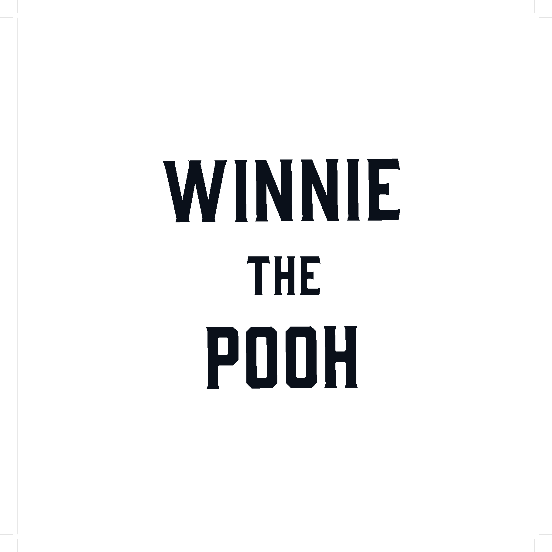
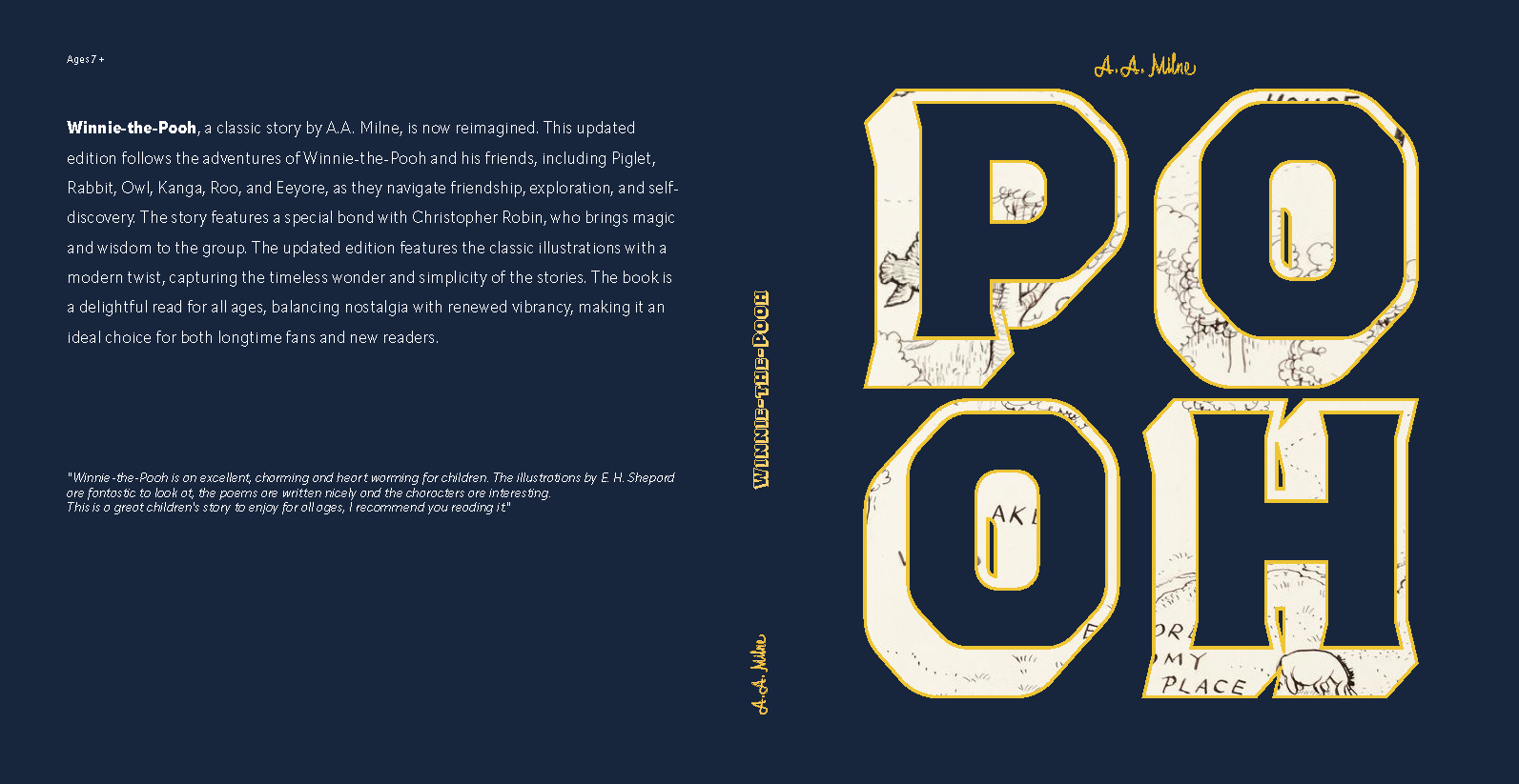
Typography became one of the most important parts of the final design. The large “POOH” lettering creates a bold first impression and turns the title into a graphic element.
By filling the letterforms with textures inspired by the original illustrations and map imagery, the typography connects the modern redesign back to the classic story. The type becomes both readable and visual, helping bridge nostalgia with contemporary design.
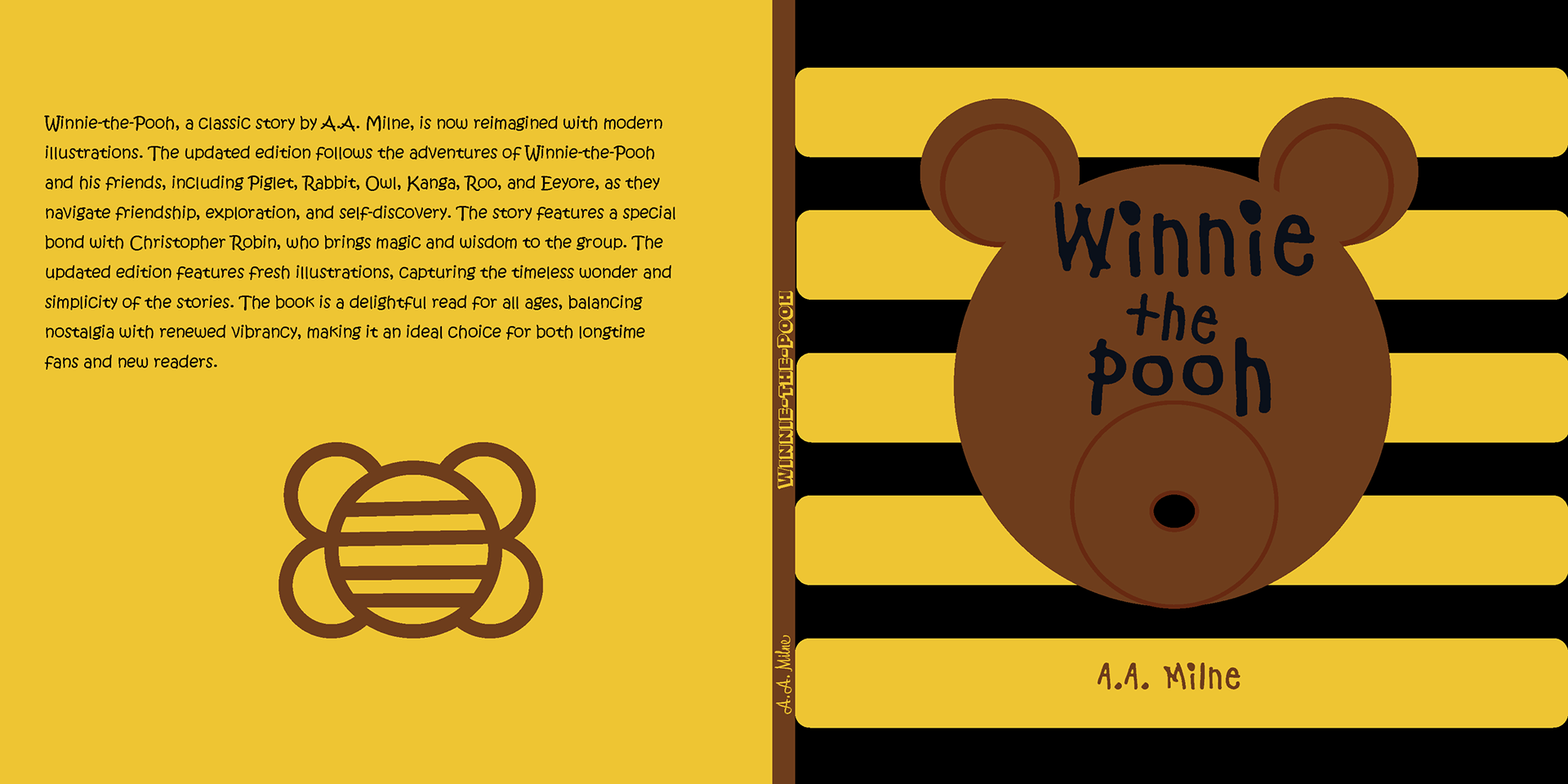
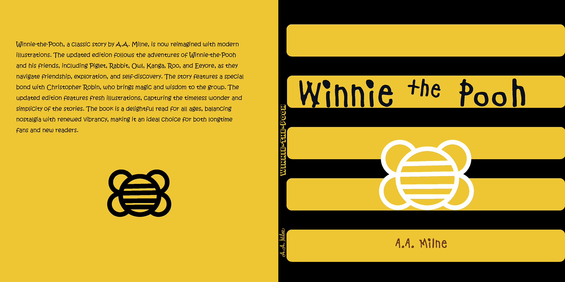
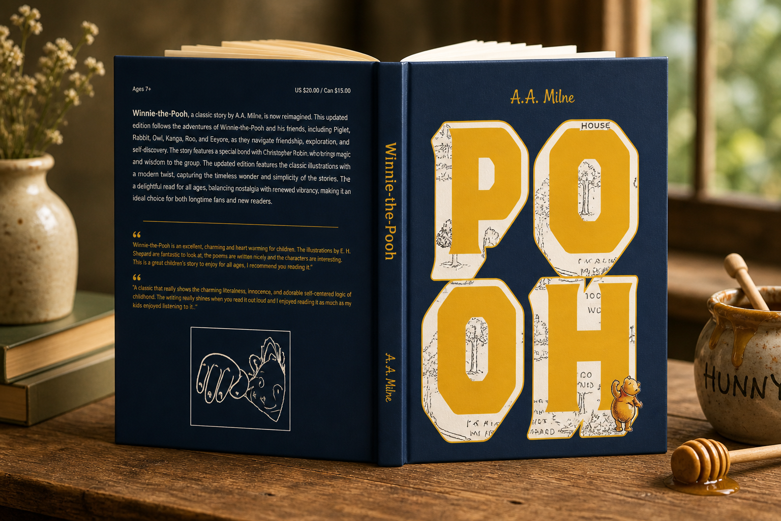
Color & Visual Language
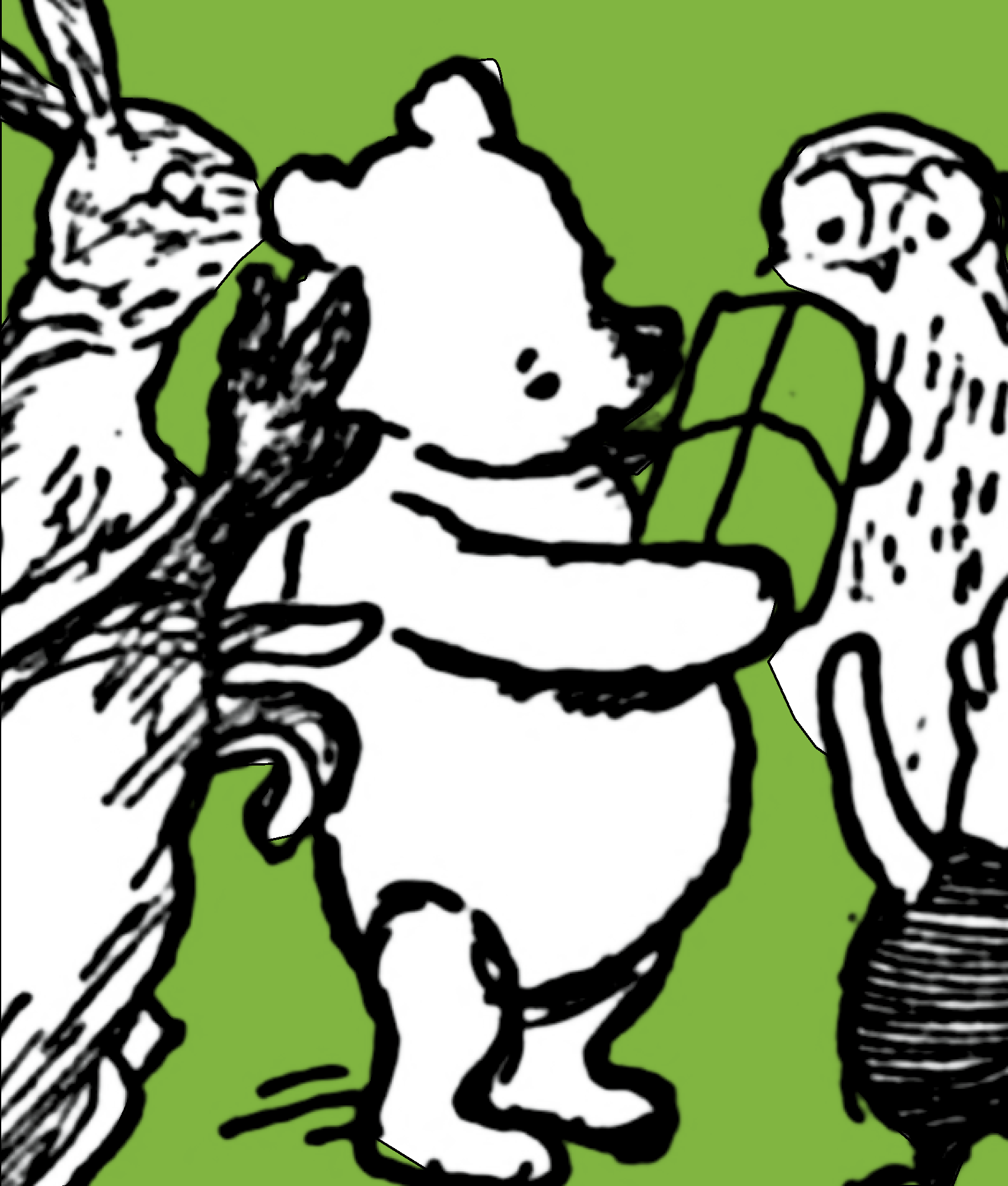
Color was used to create mood and guide the reader through the story. The final book uses a bold but controlled palette, including navy, gold, green, red, purple, and honey-inspired tones.
Each color supports a different feeling:
- Navy creates structure and contrast
- Gold/yellow connects to honey, warmth, and childhood
- Green reflects the forest and natural setting
- Red and purple add energy, movement, and playfulness
This color system helped make the book feel expressive while still unified.
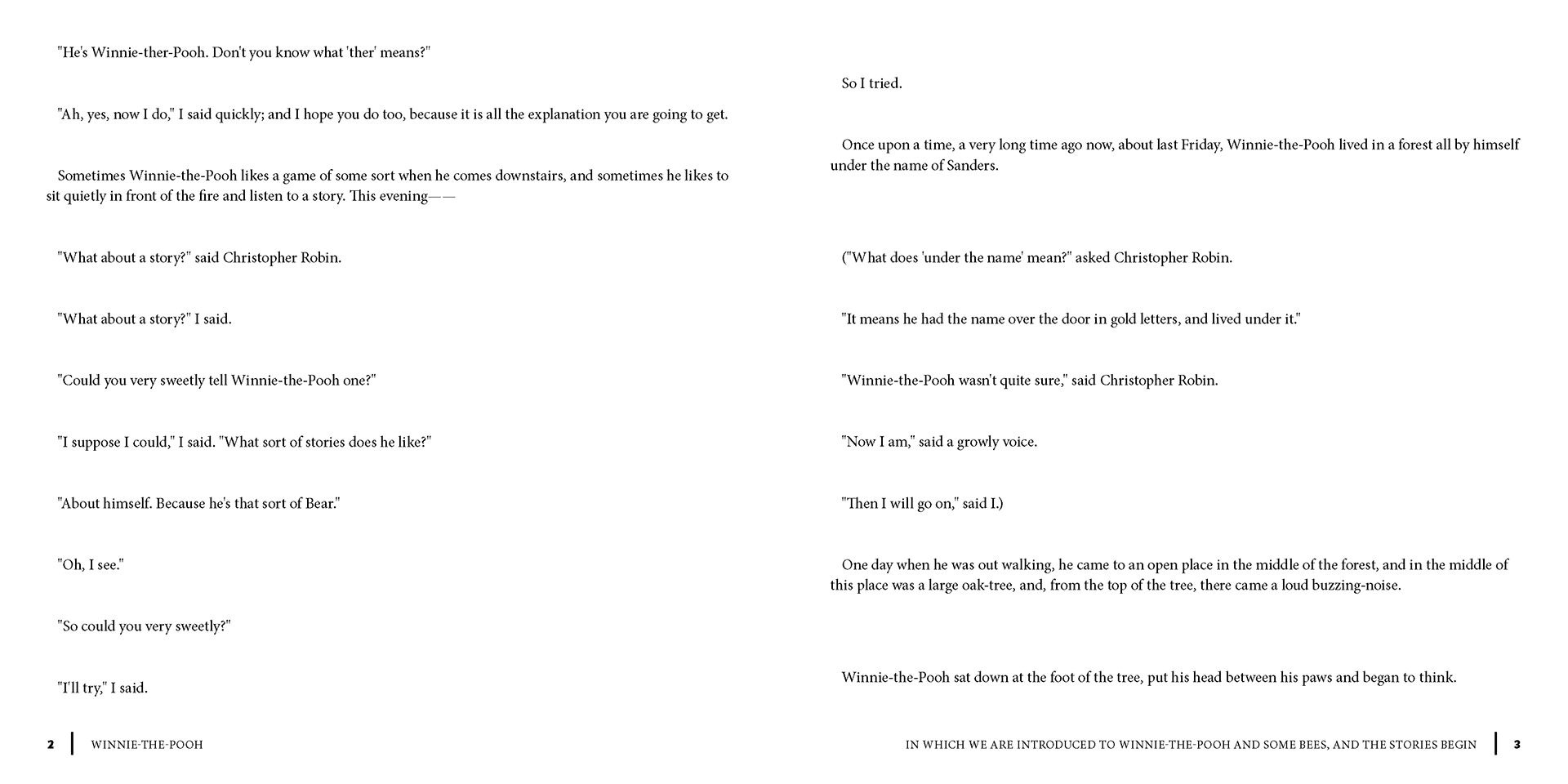
Interior Layout System
The interior pages were designed to balance readability with visual storytelling. I used clean spacing, structured margins, and consistent typographic hierarchy so the text remained easy to follow.
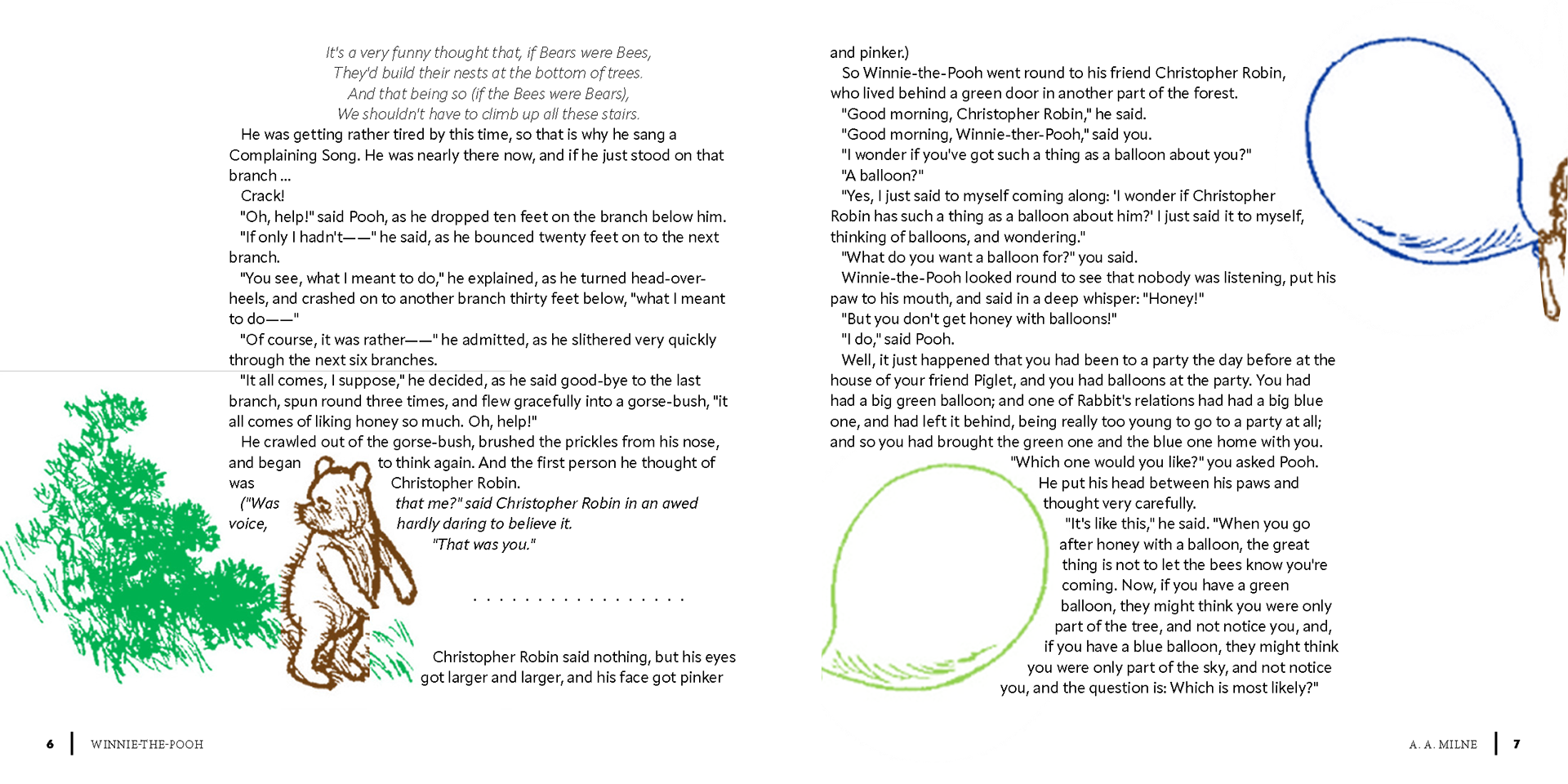
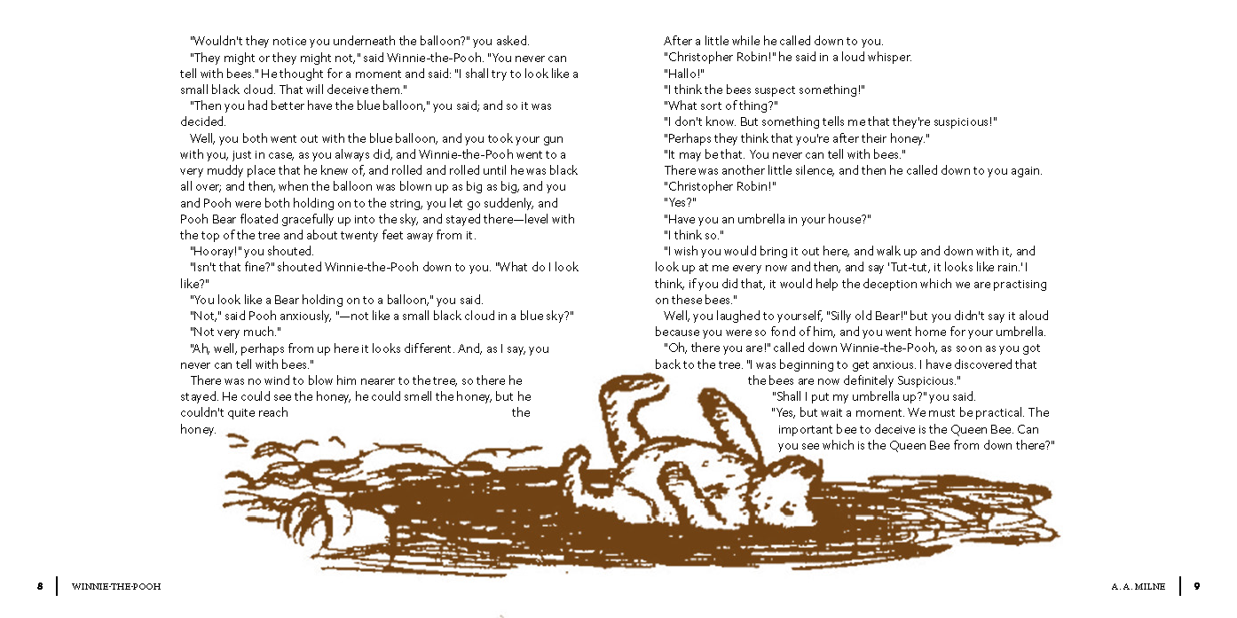
Illustrations were placed intentionally to support pacing and create visual pauses throughout the book. Some pages feature full-color illustration moments, while others let the text breathe.
The goal was not to overwhelm the story, but to enhance it.

Table of Content
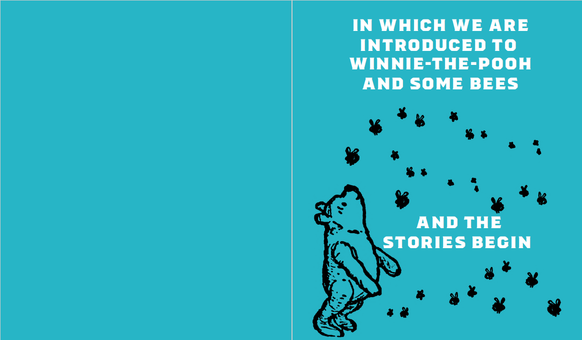
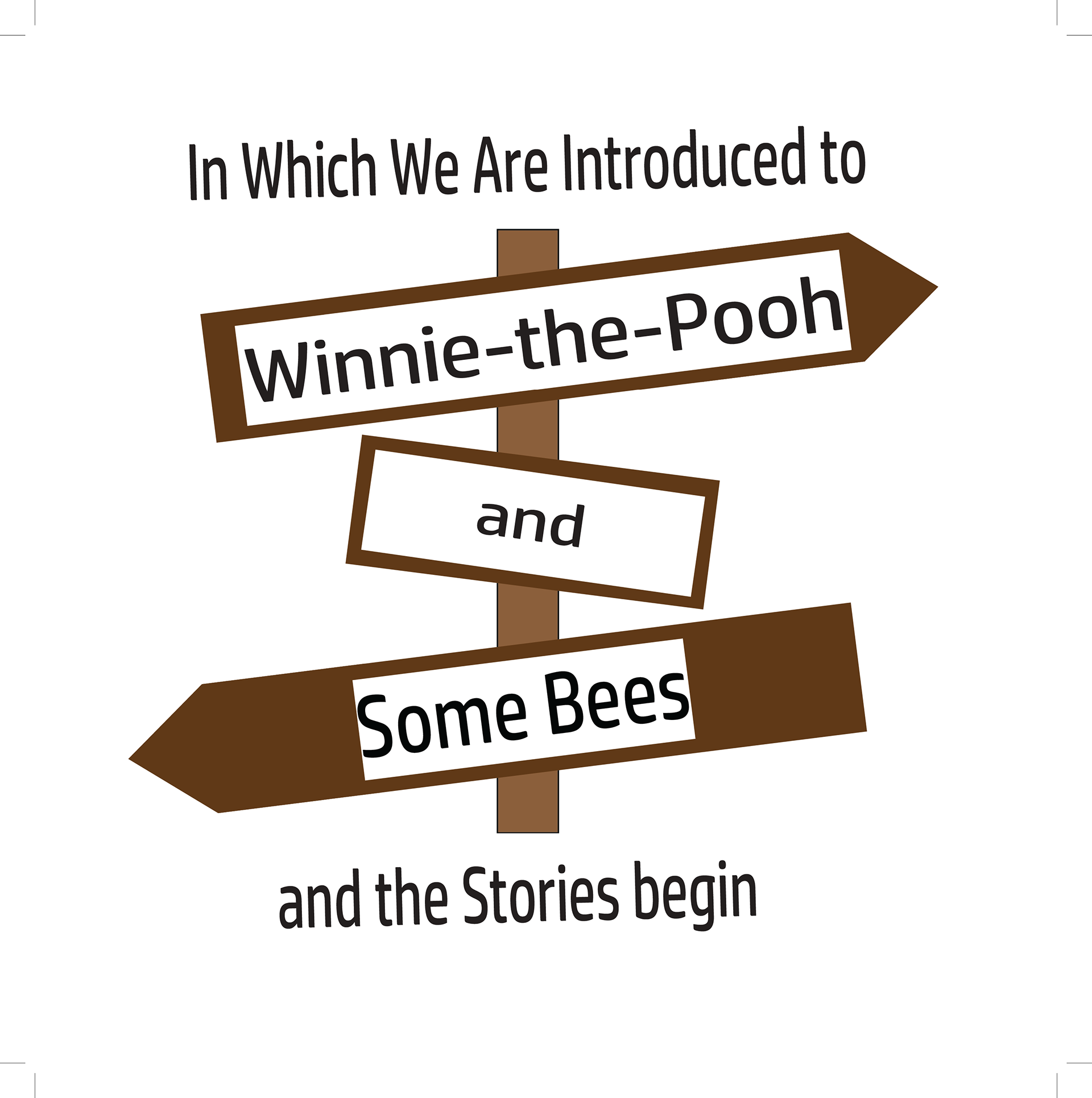
Chapter Title Page
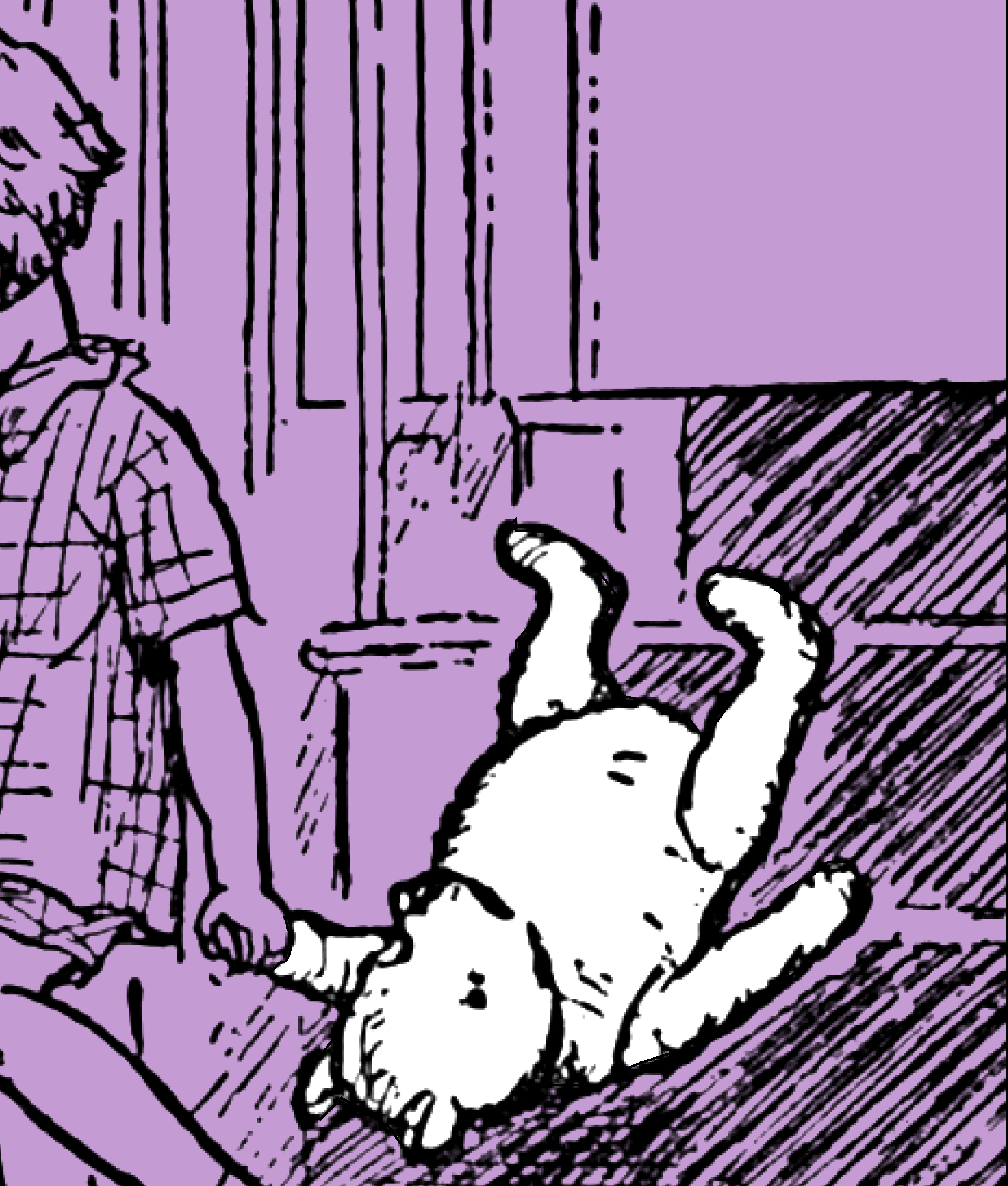
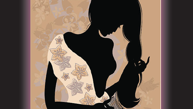
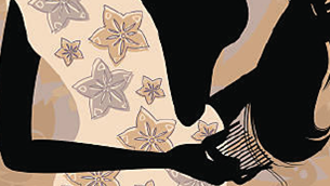
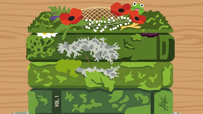
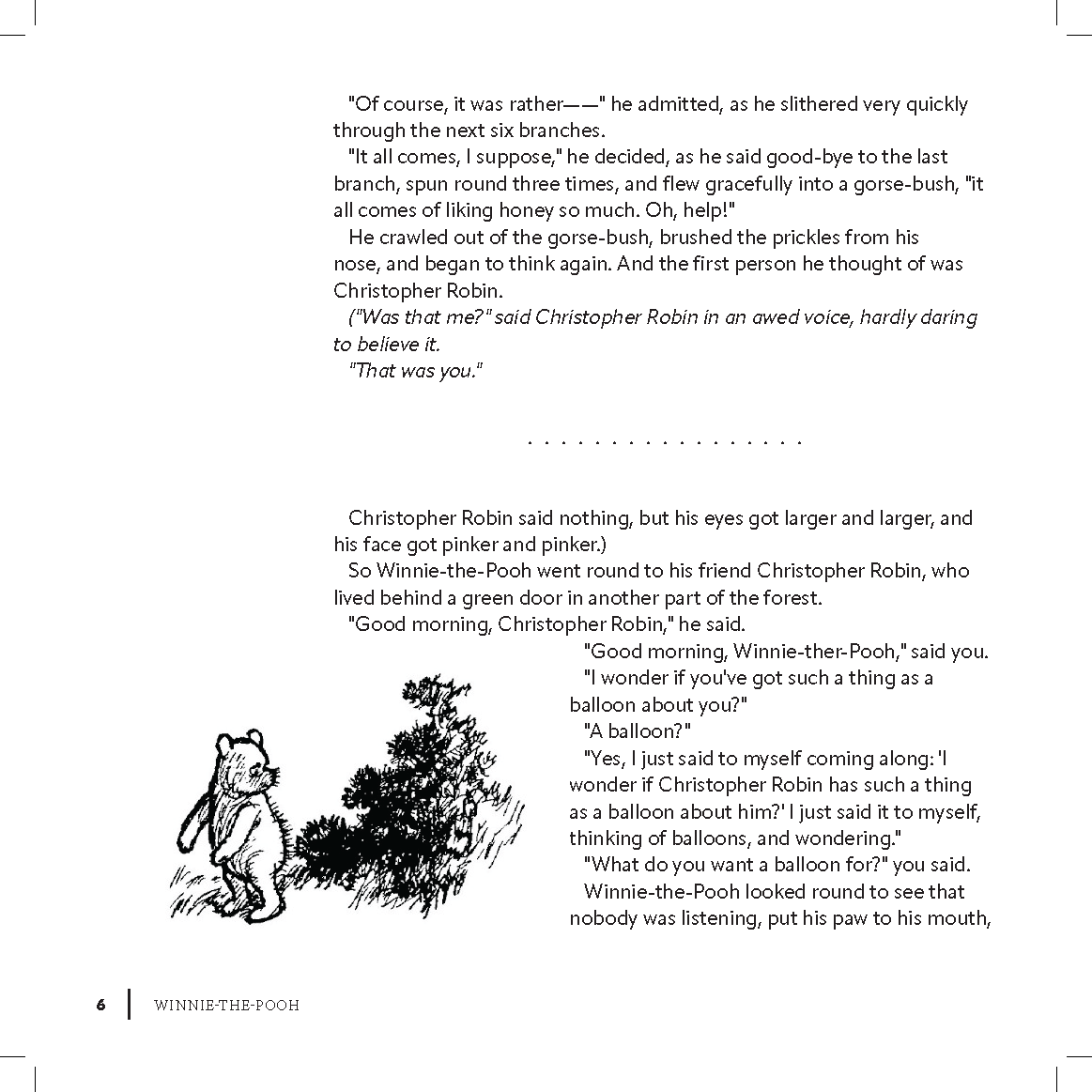
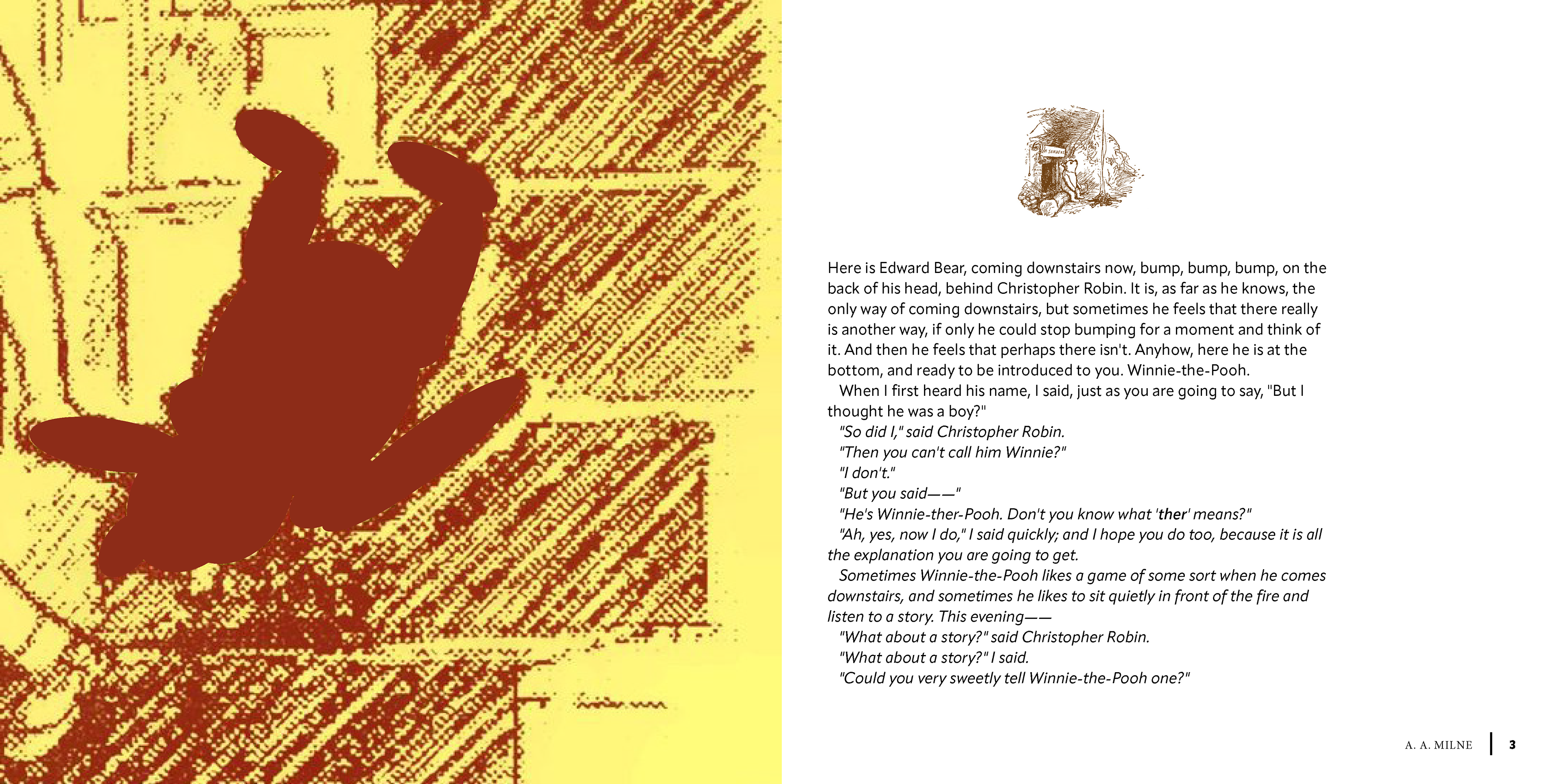
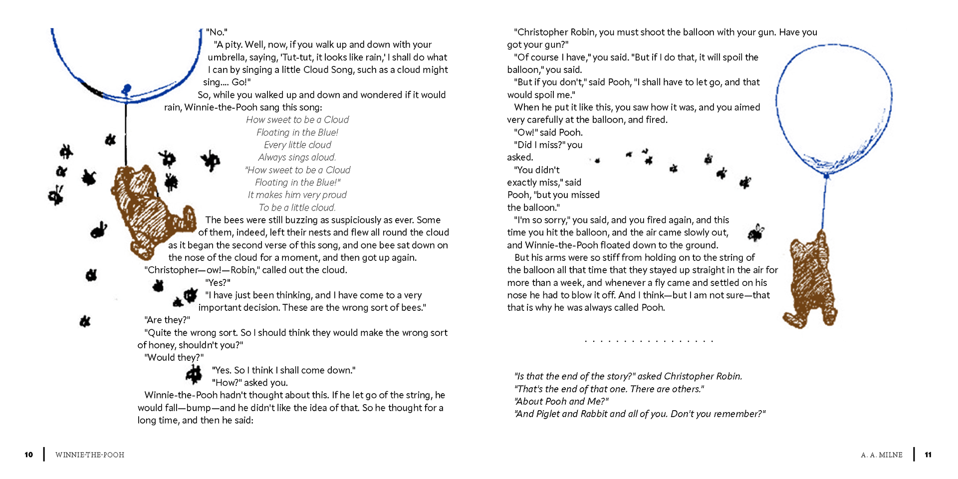
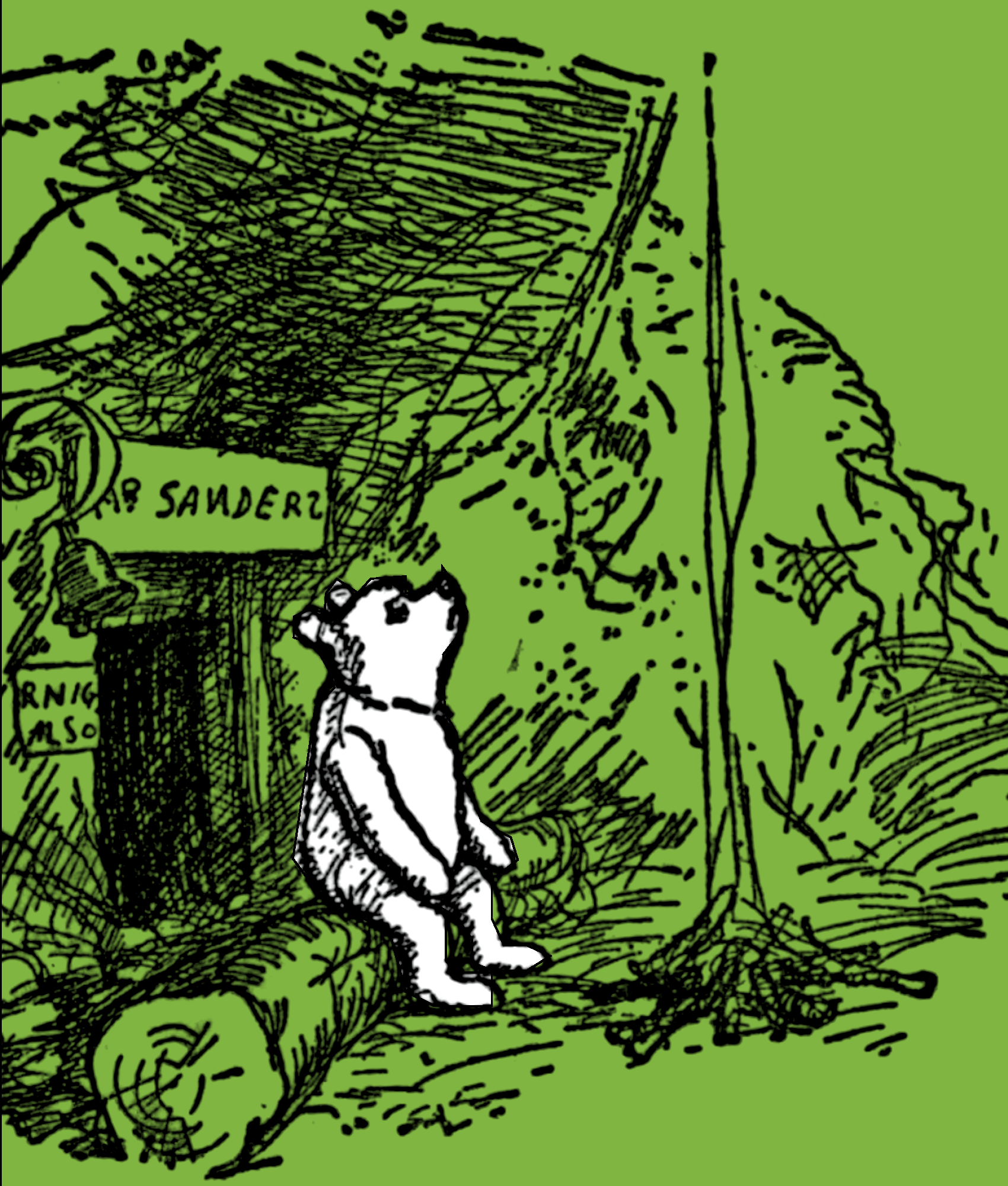
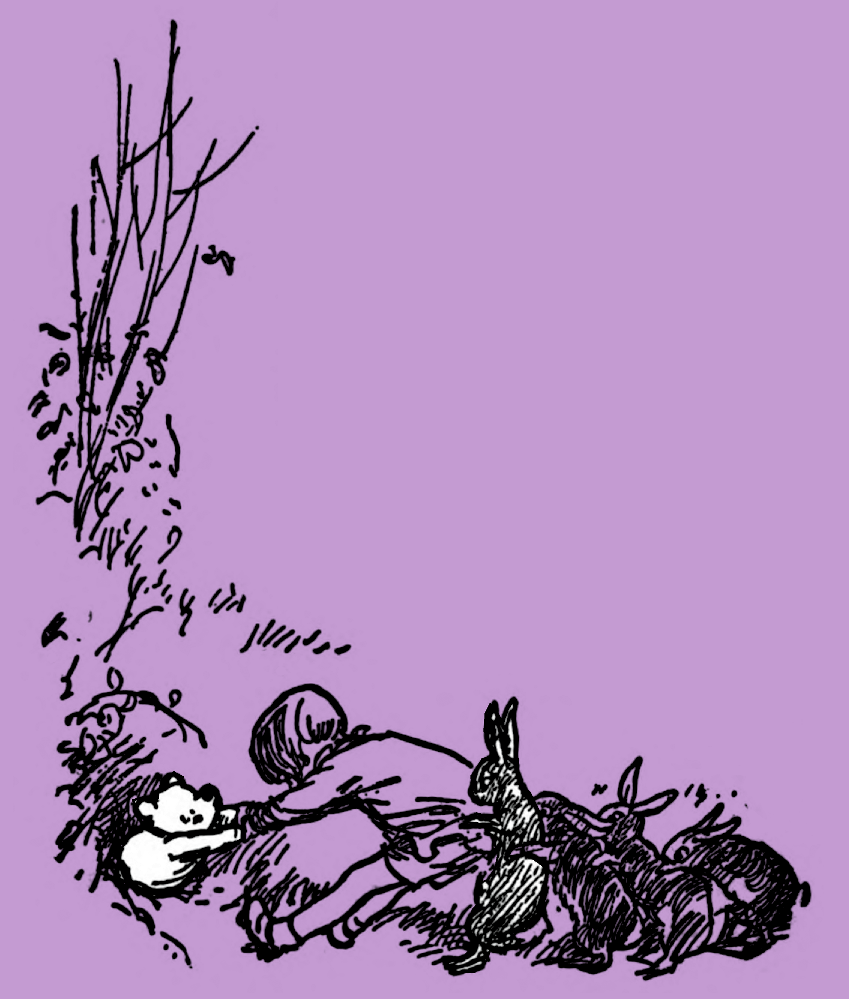
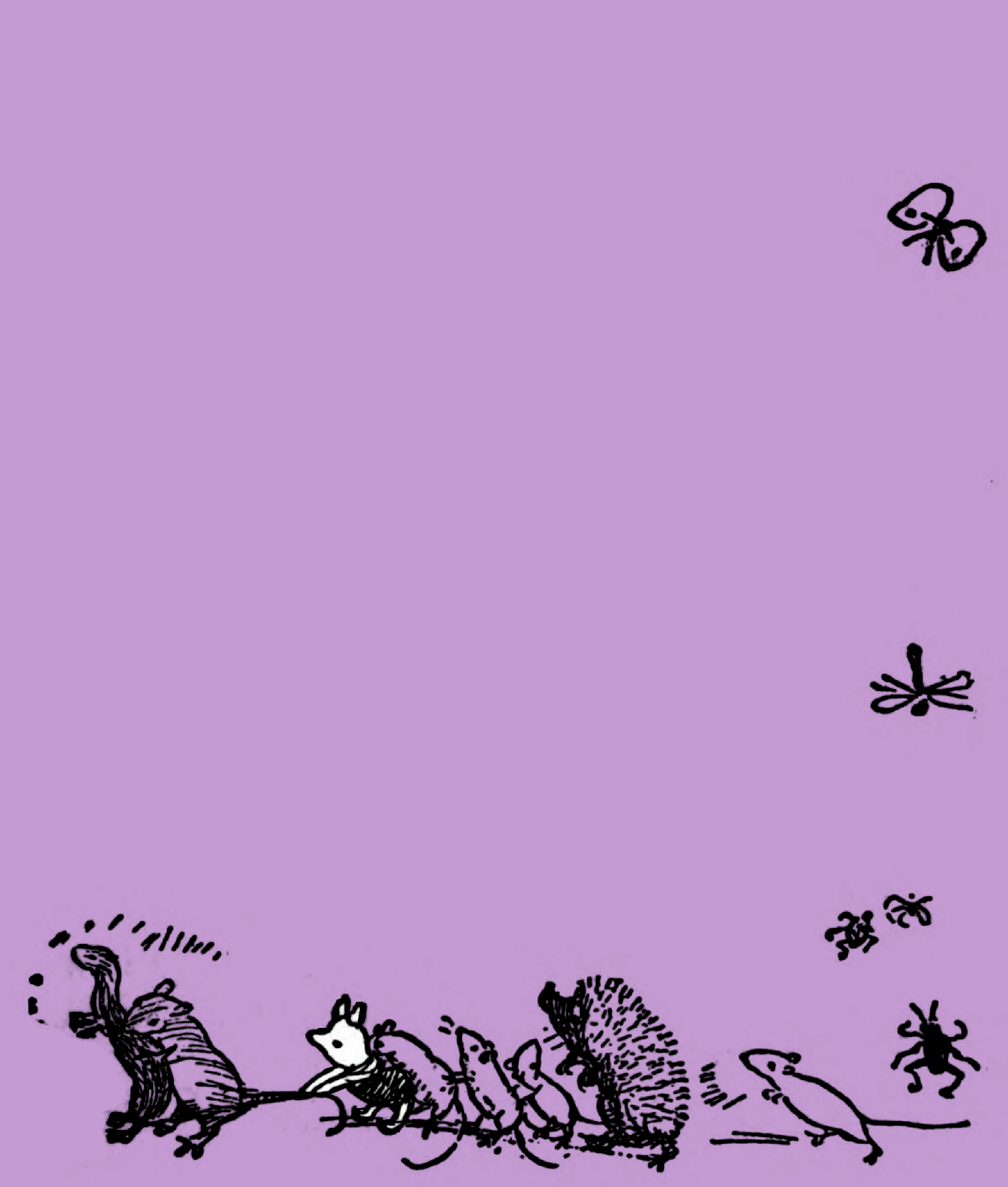
Example of Image within the Book
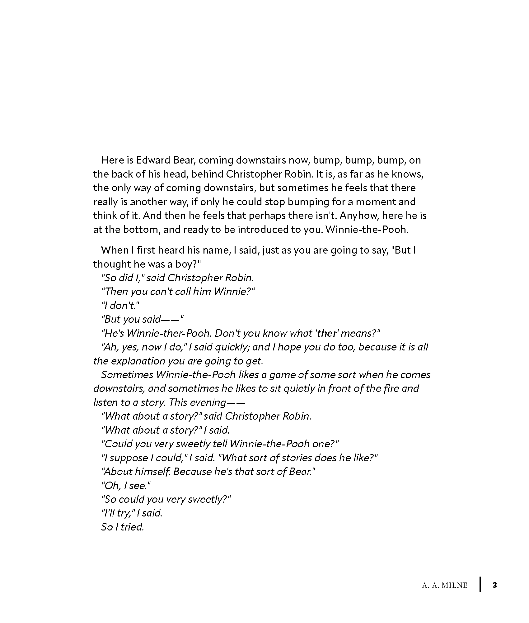
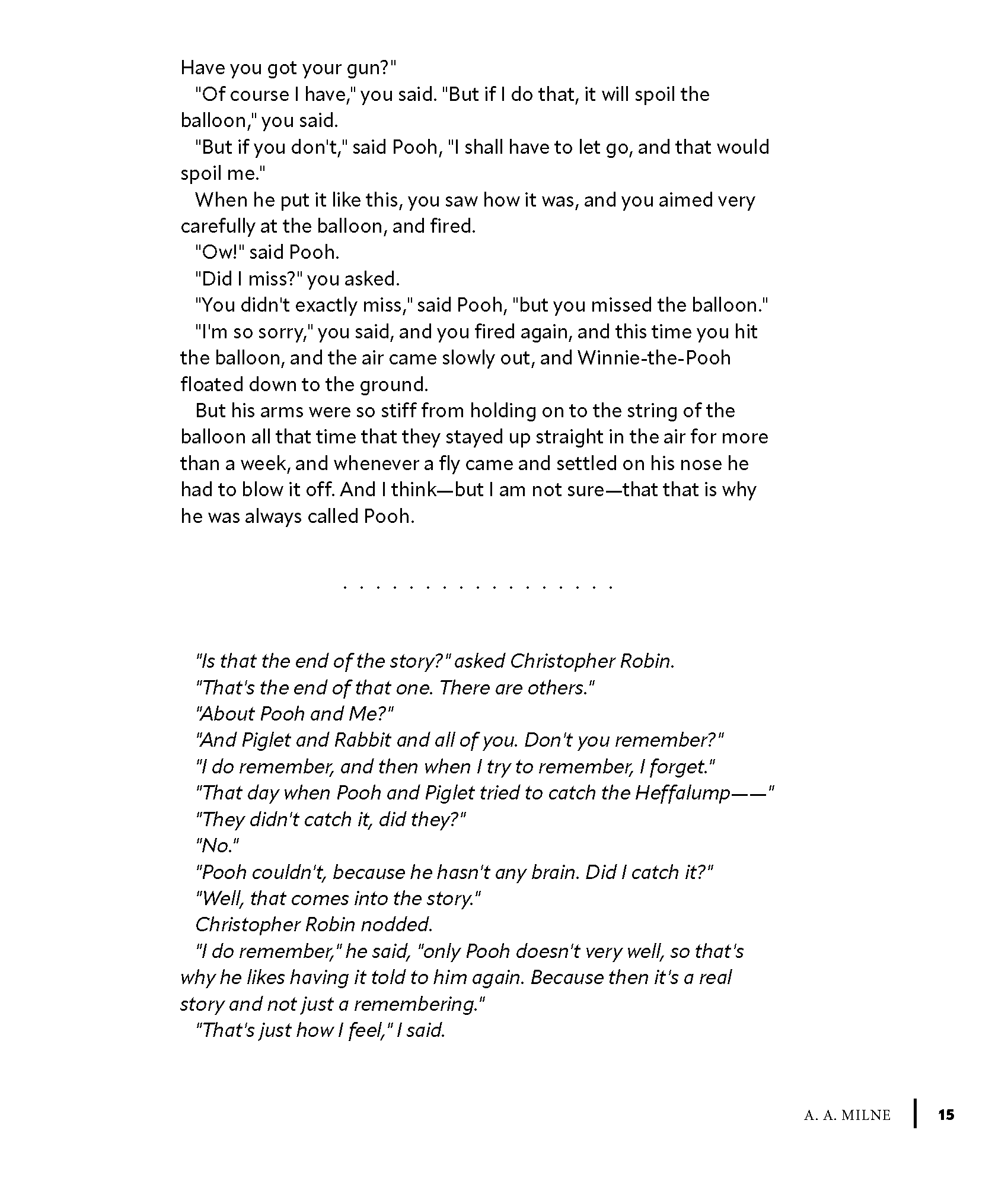
Example of text within the book
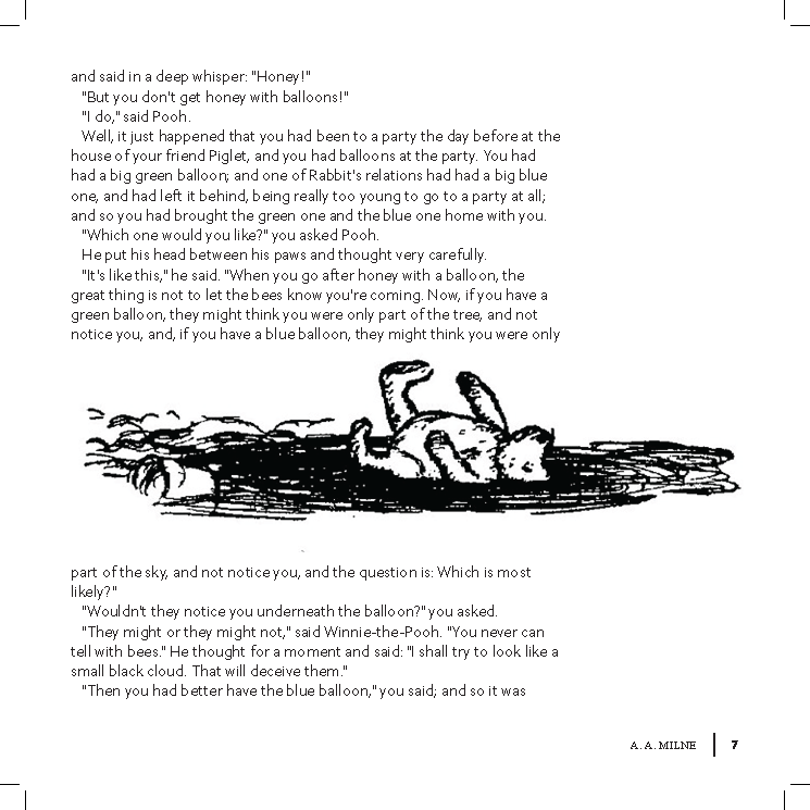
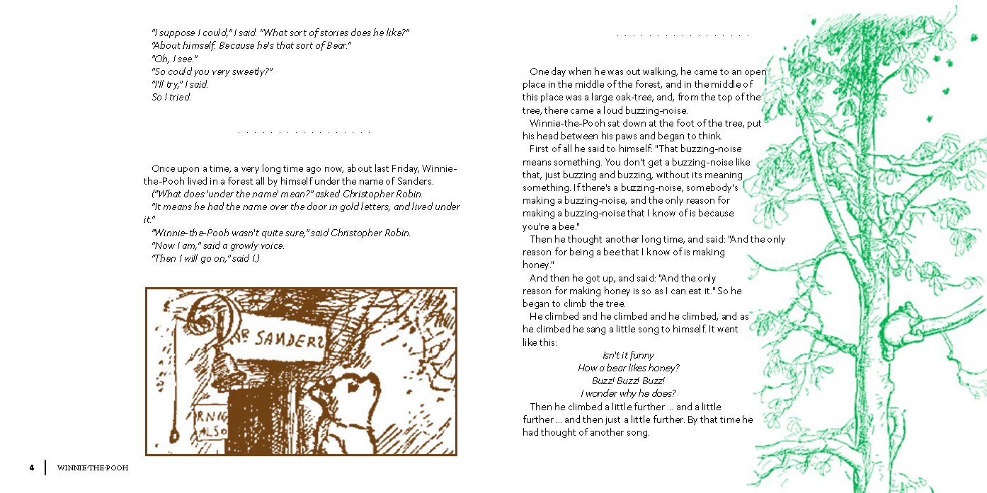
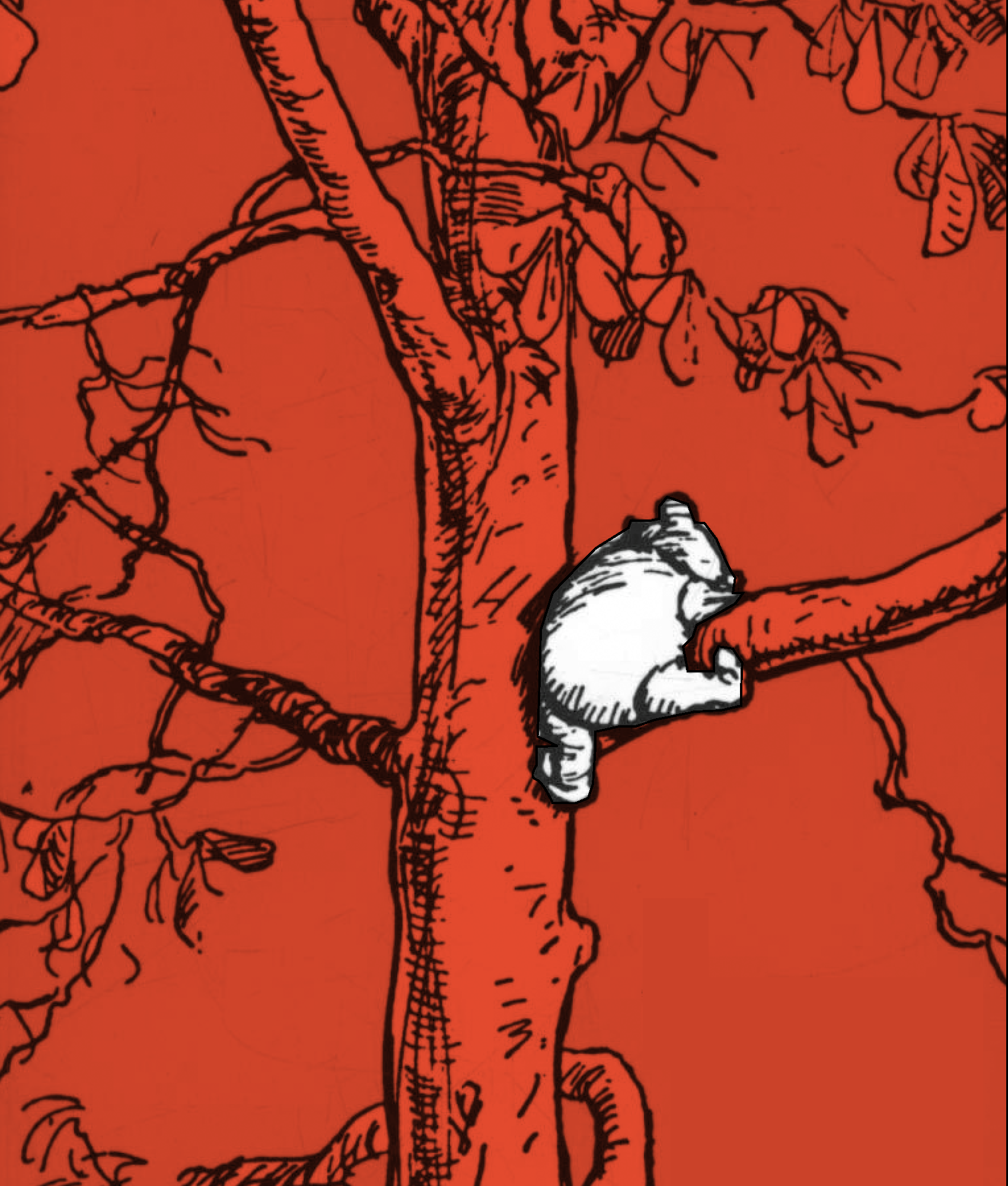
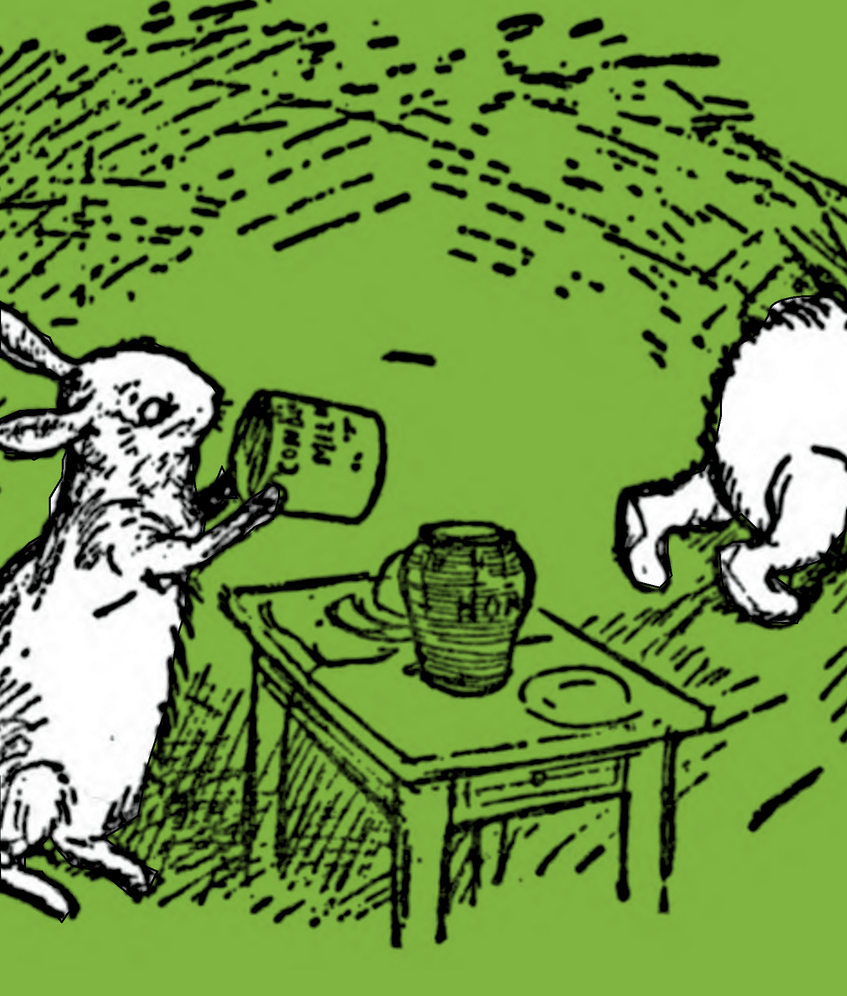
Example of Image within the book
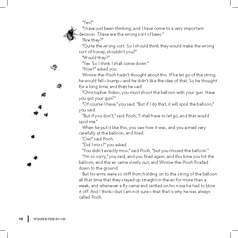
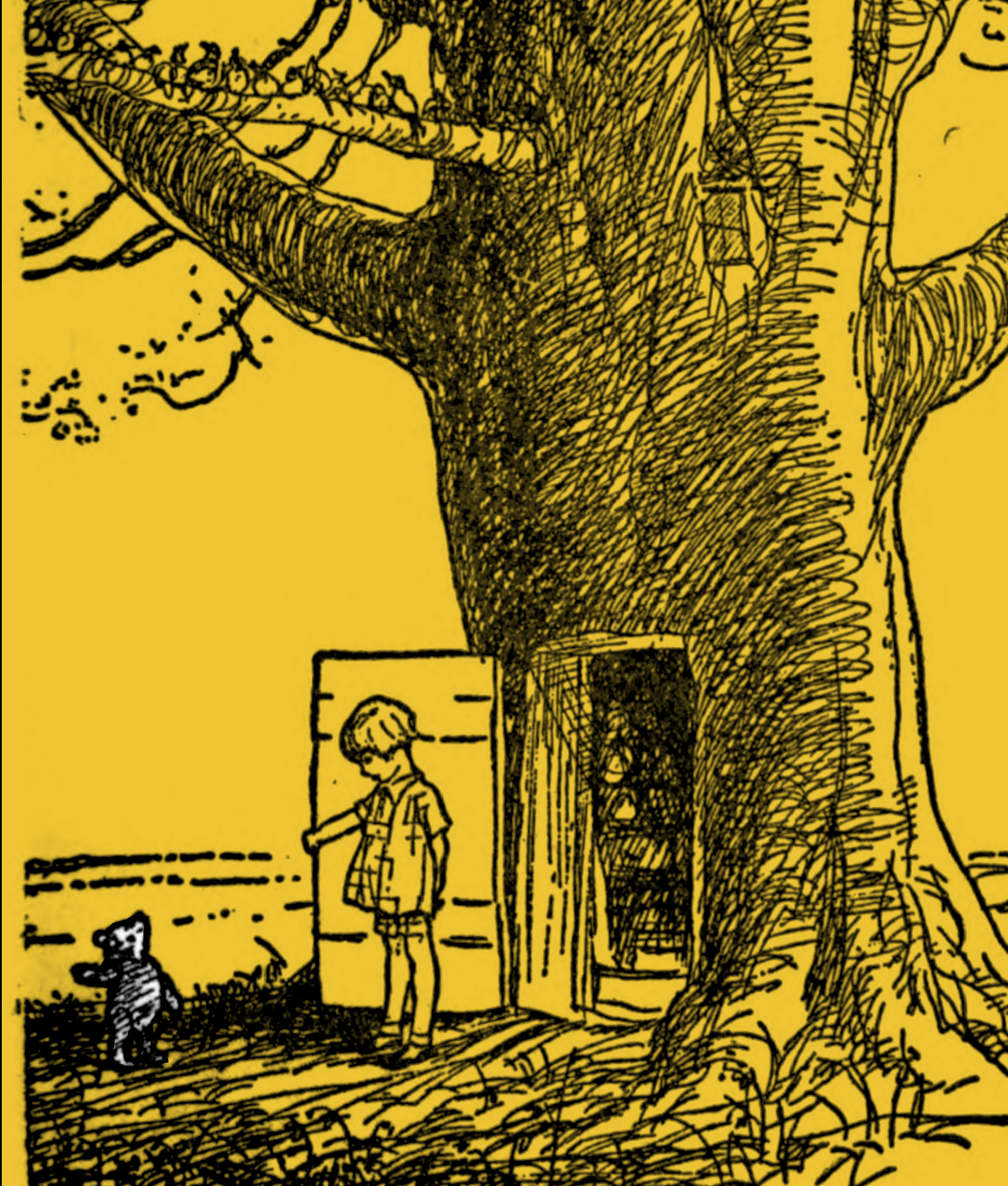
Example of Image within the book
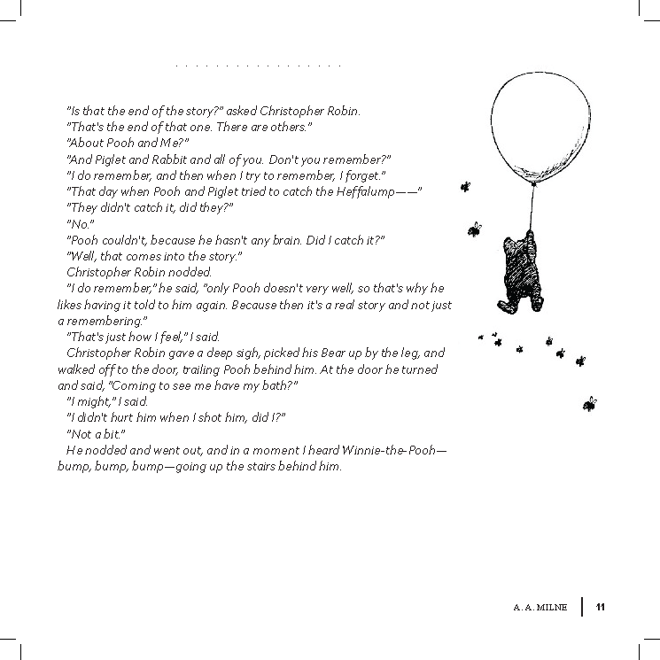
Example of Image within the book
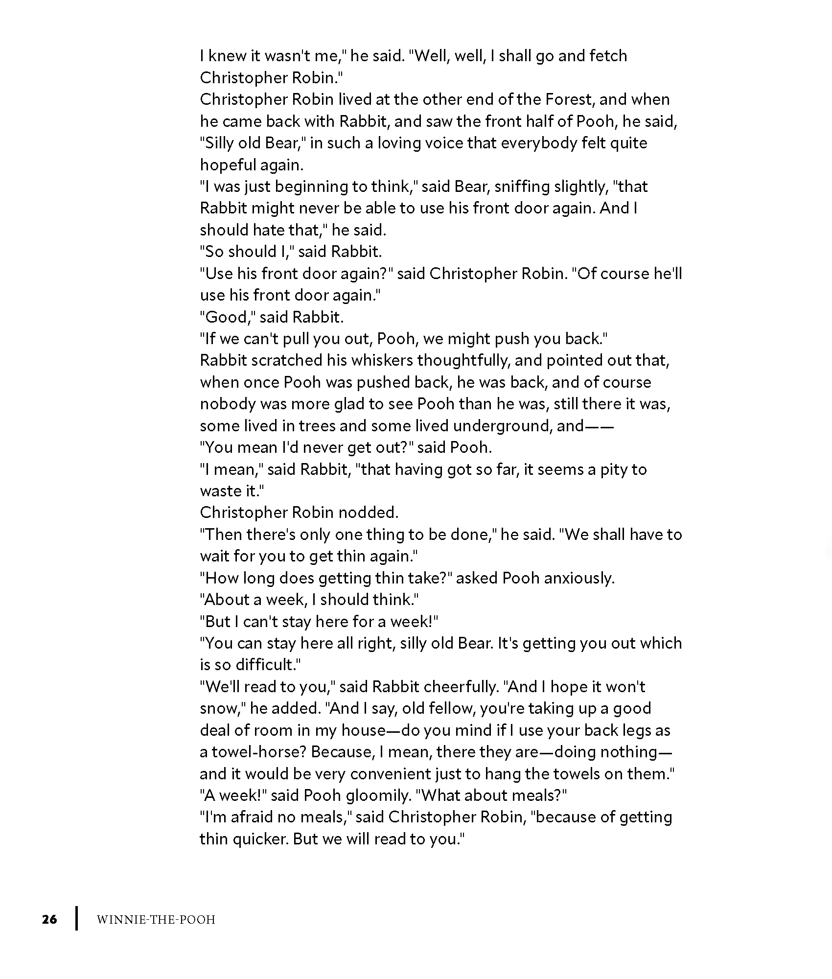
Example of text within the book
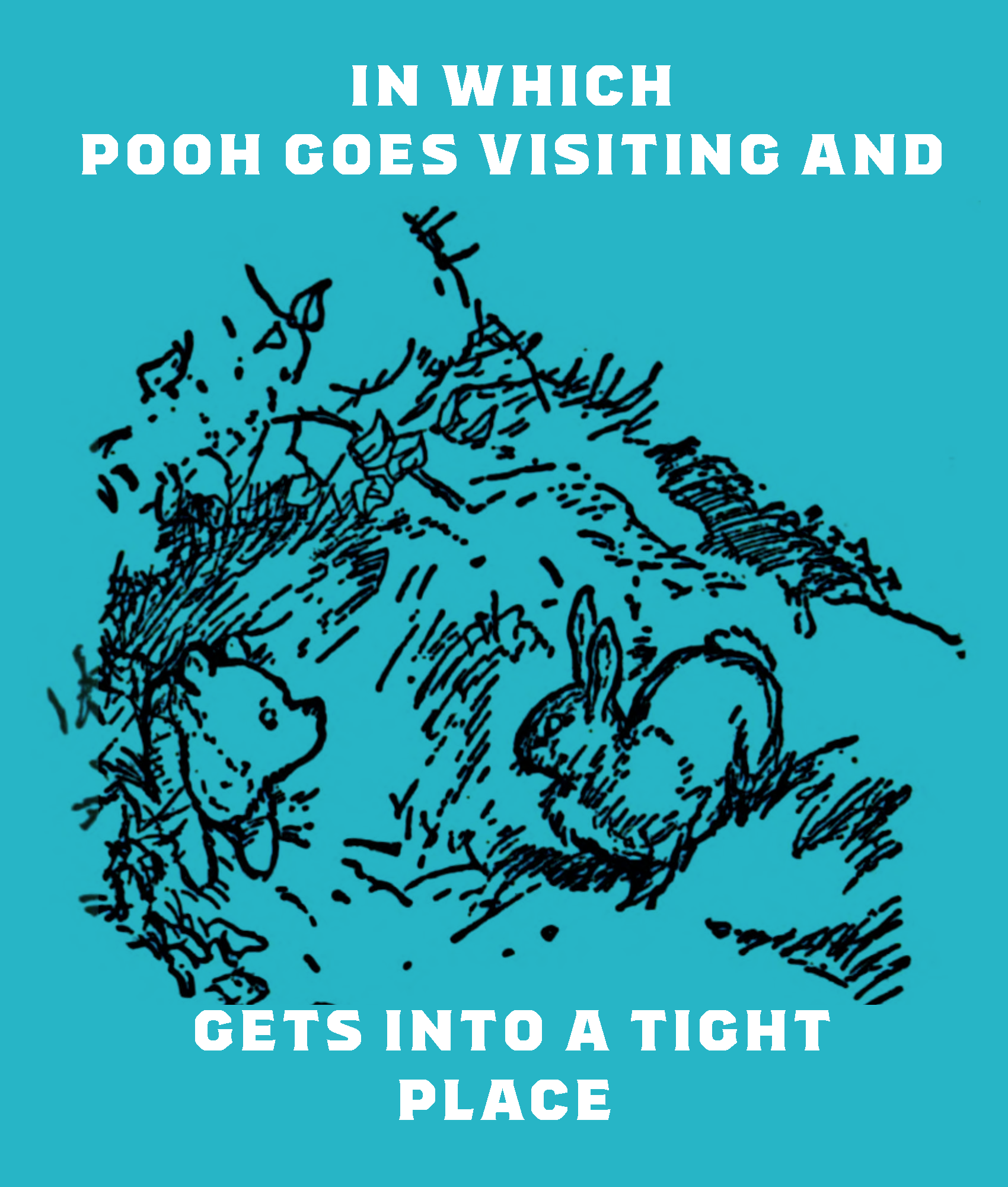
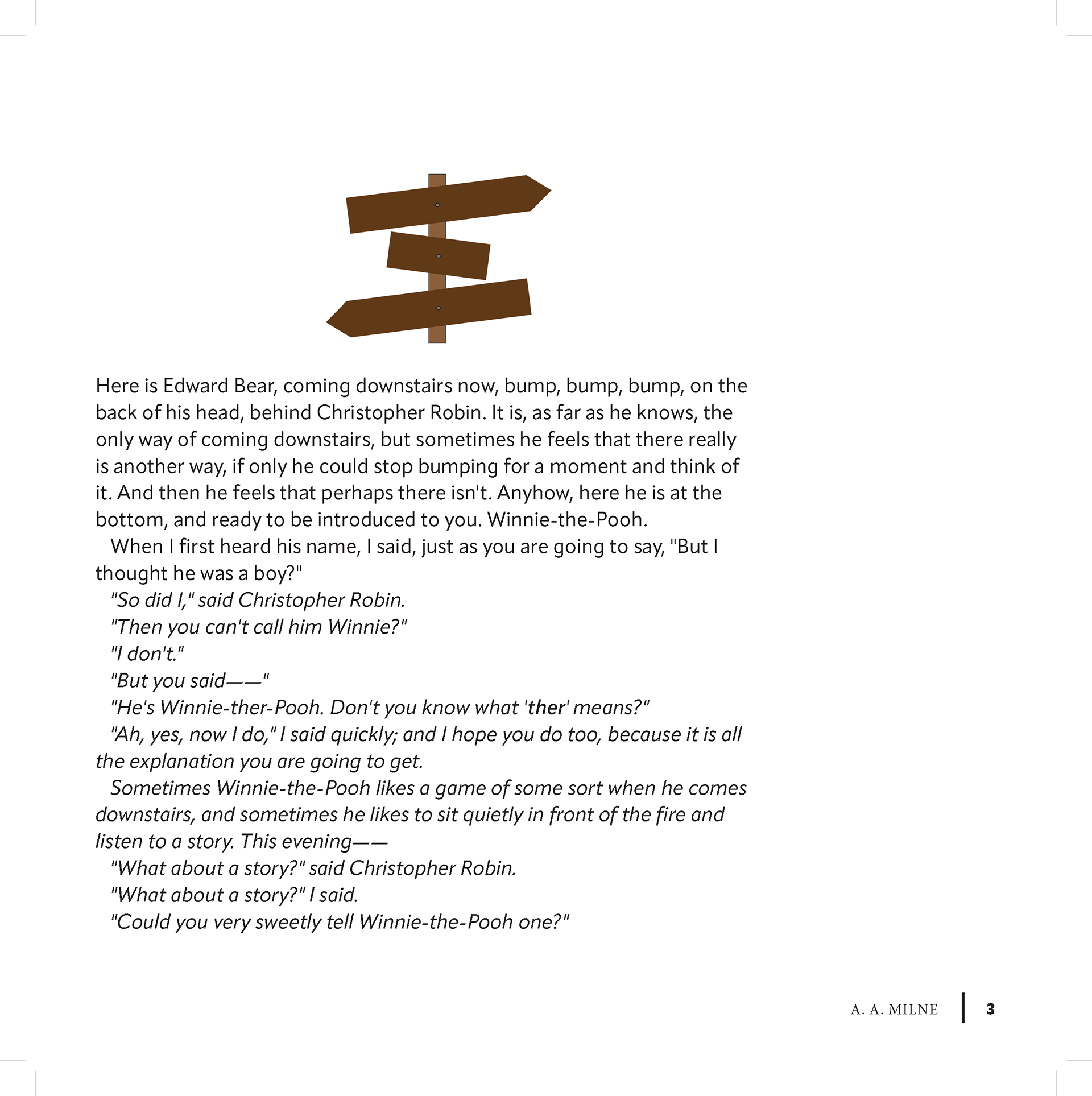
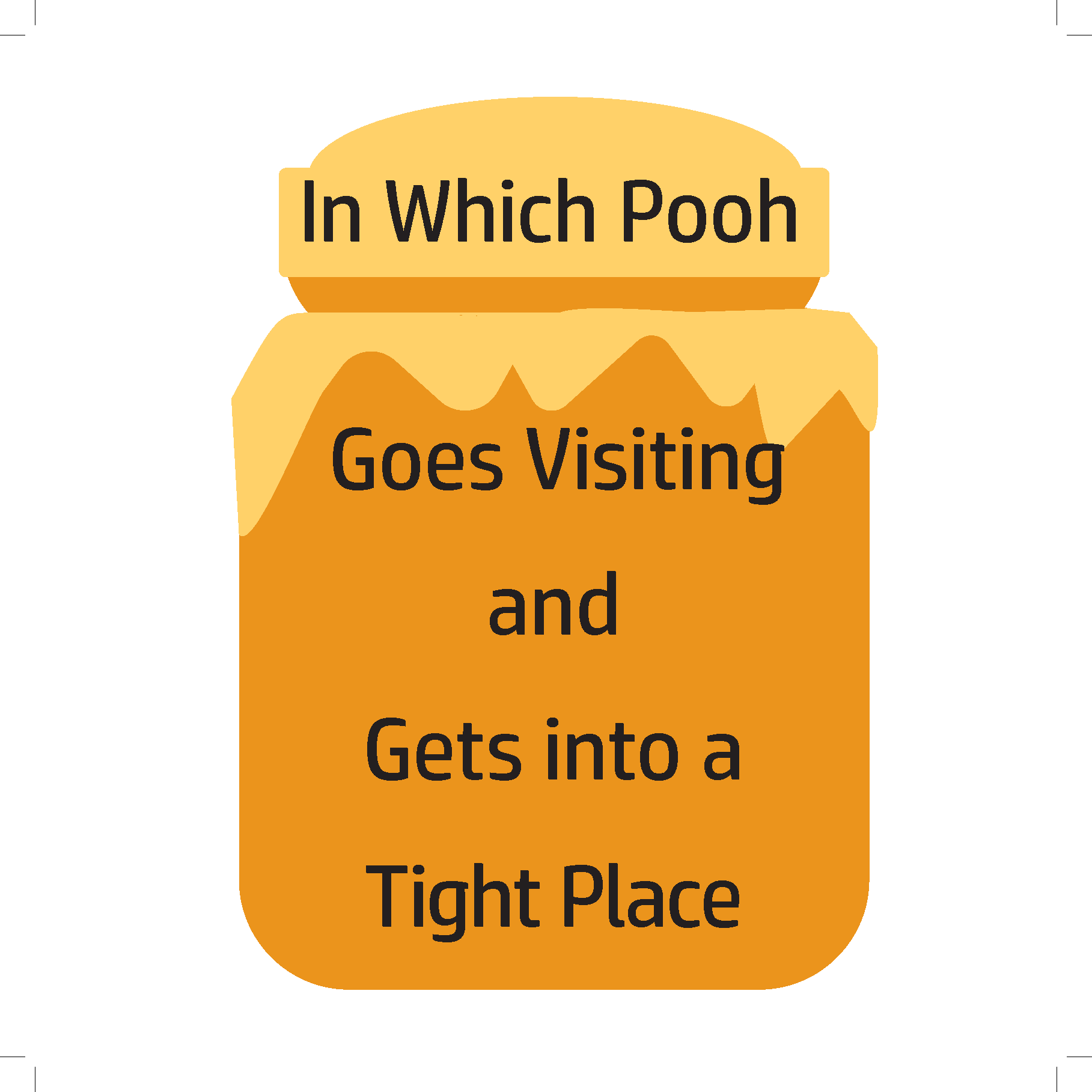
Example of Chapter Title Page
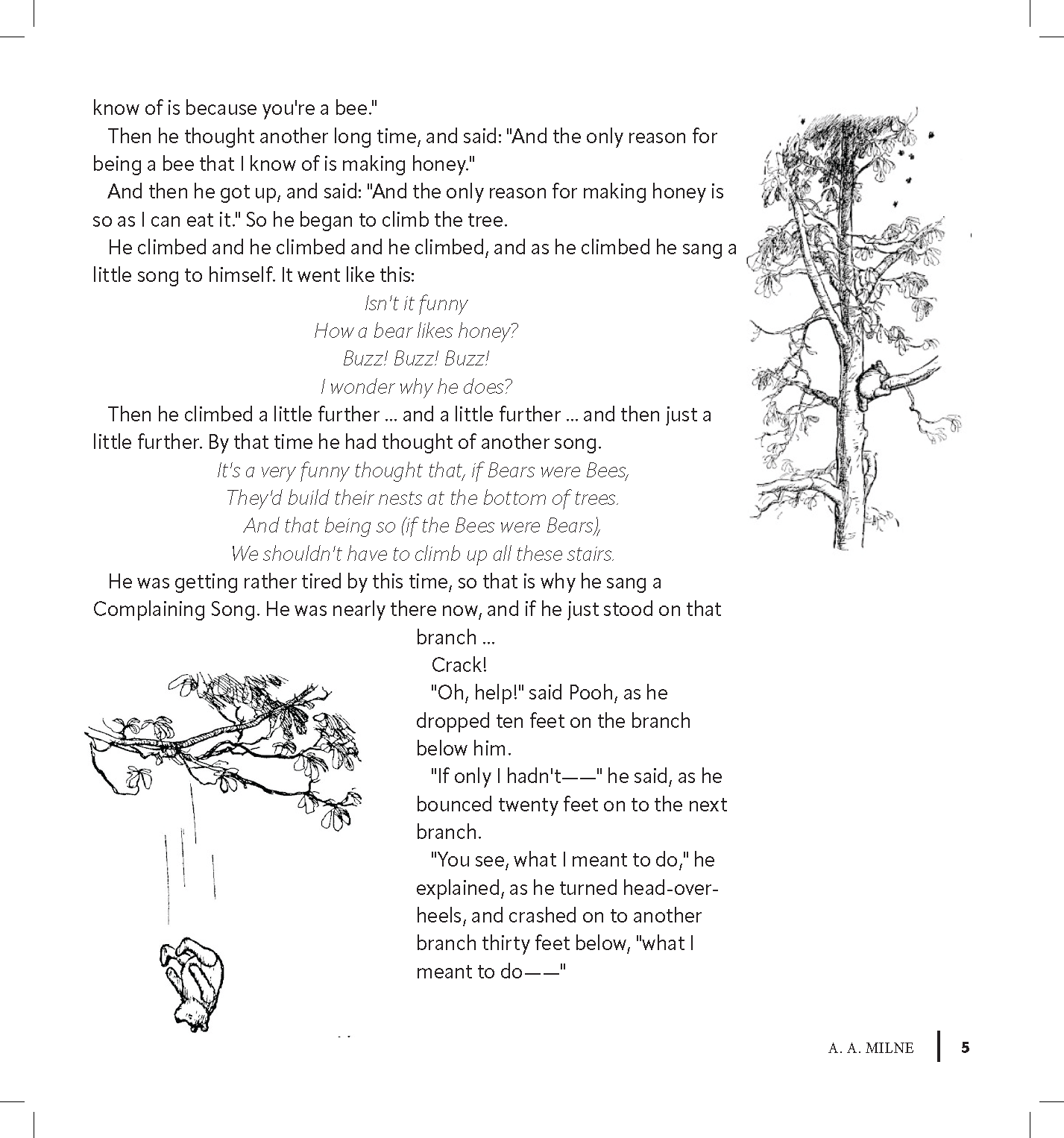
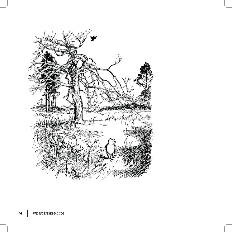
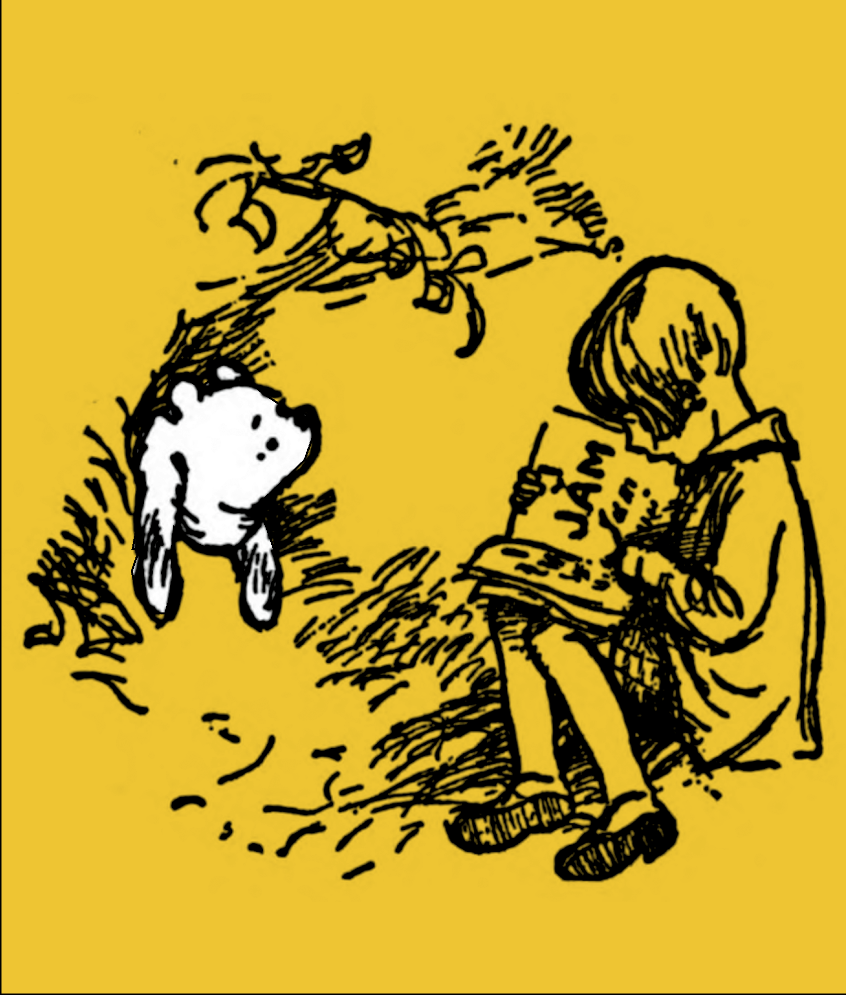
Example of Image within the Book
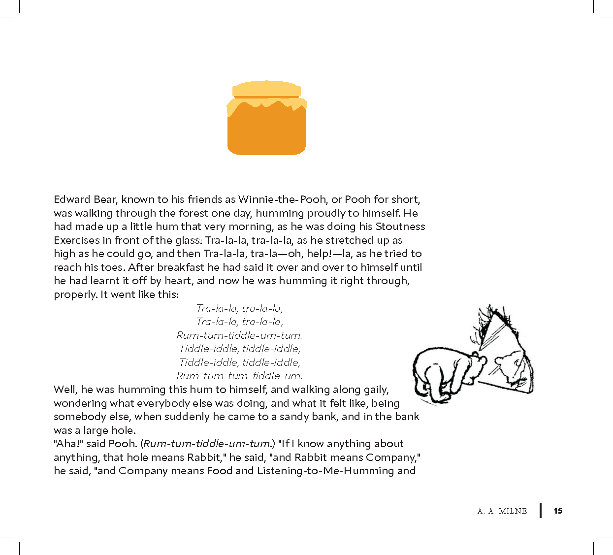
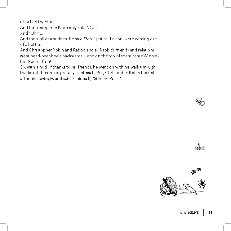
Example of text within the book
Example of Image within the Book
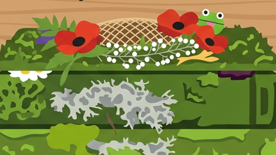
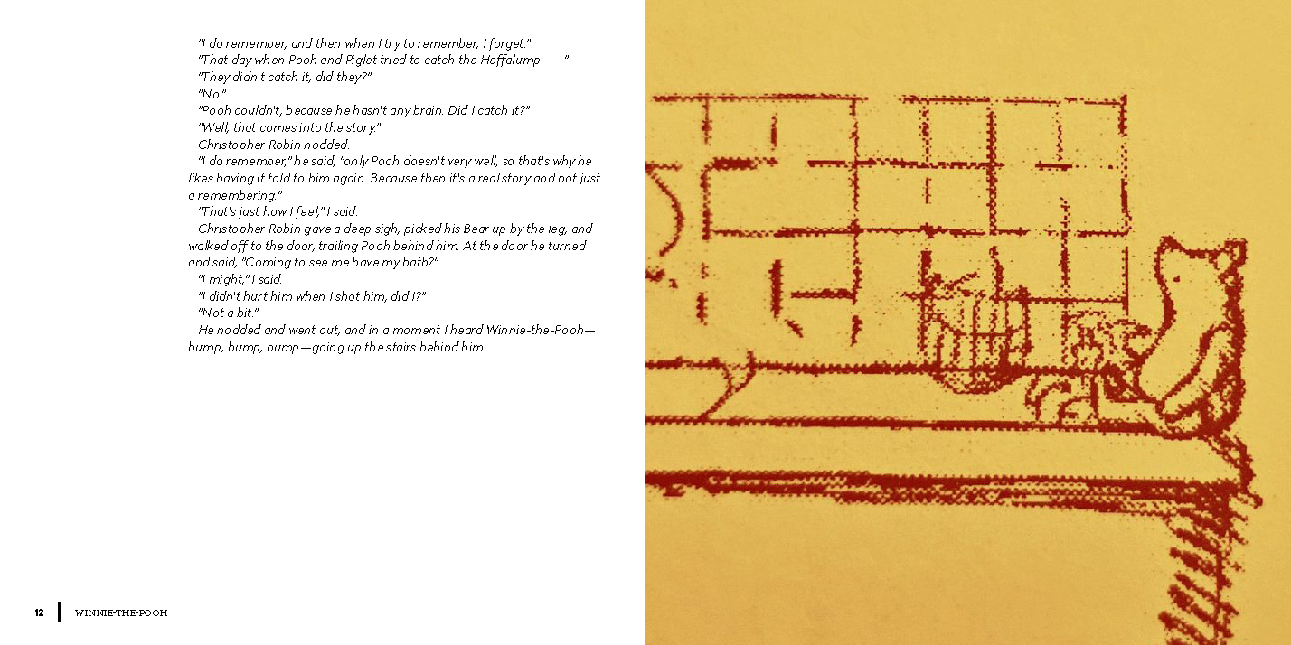
Example of half image spread
Example of second half of image spread
Example of Image within the Book
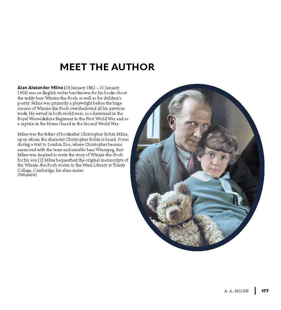
Meet the author page
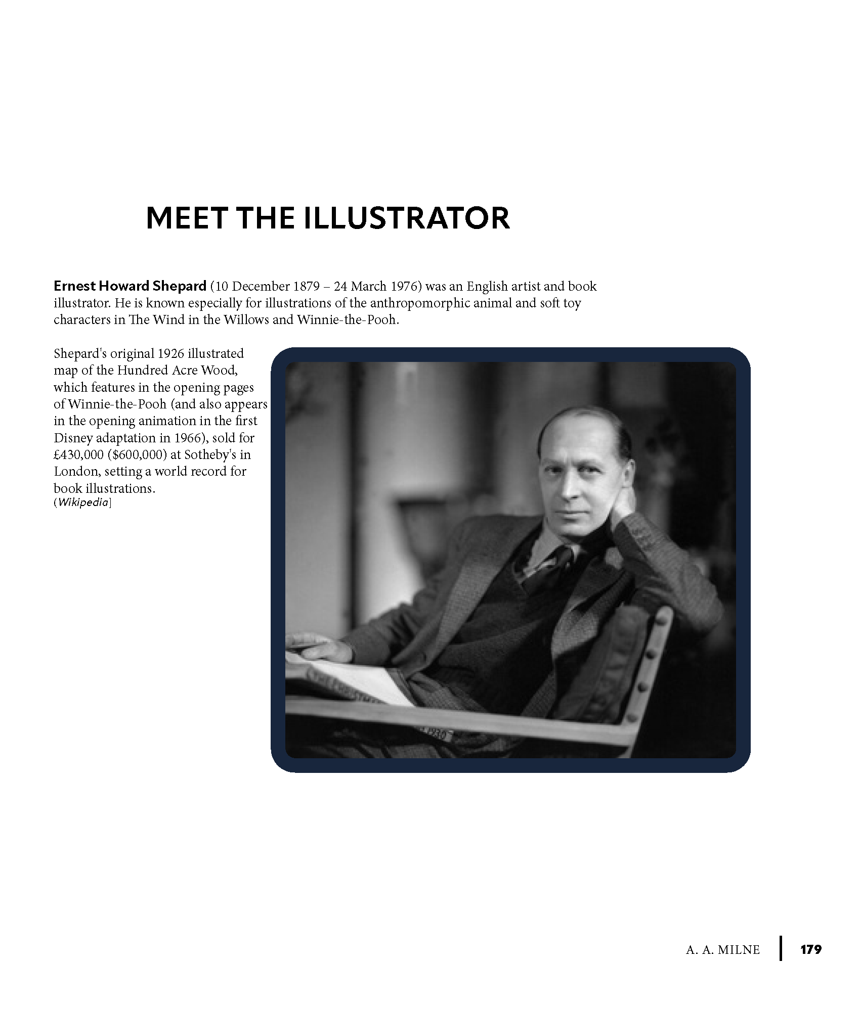
Meet the illustrator page
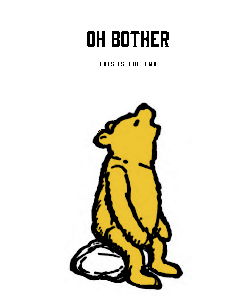
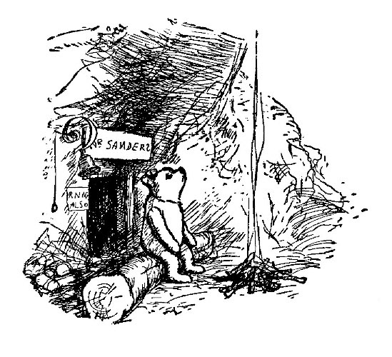
End of book image
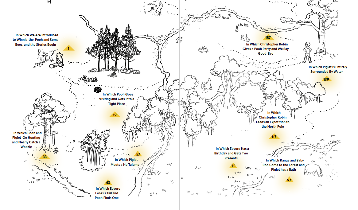
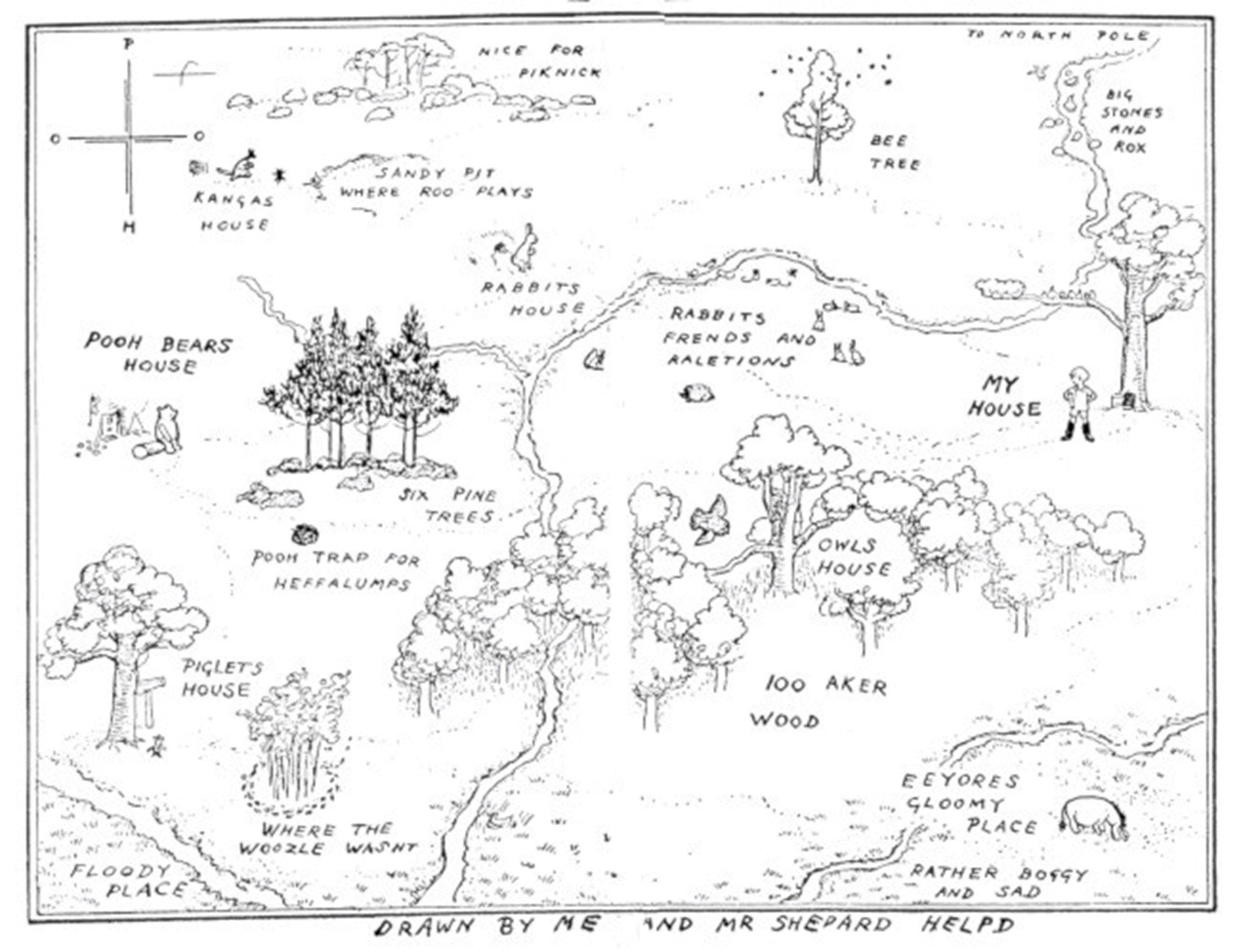
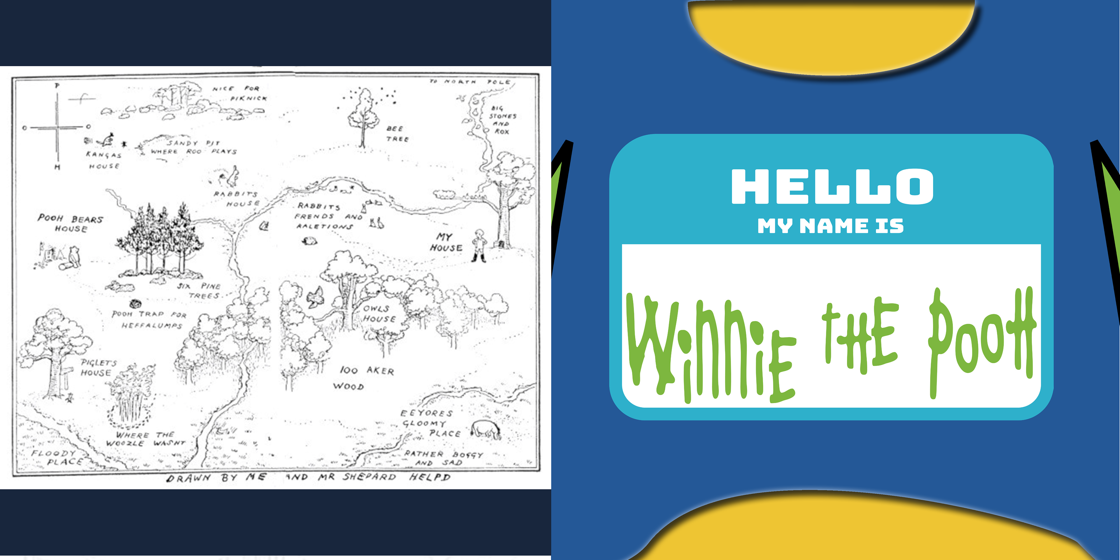
World Building & Navigation
The Hundred Acre Wood map became an important visual element in the final design. It helped establish the setting and gave the reader a sense of place.
Using the map as part of the book's system strengthened the world-building and connected the chapters. It also supported the feeling of exploration, which is central to the story.
Final Result
The final design creates a cohesive modern book system that includes a bold typographic cover, structured interior layouts, chapter openers, map-based navigation, and colorful illustration moments.
The redesign preserves the charm of Winnie-the-Pooh while giving it a more contemporary editorial style. The final book feels playful, warm, nostalgic, and visually engaging.
Reflection
This project strengthened my ability to translate written content into visual storytelling. I learned how typography, color, layout, and illustration can work together to shape a reader's experience of a story.
One of the biggest takeaways was the importance of iteration. The final design became stronger because I explored many directions first, from emotional moodboards to sketch concepts to digital cover variations.
This project reflects my design process: researching the story, exploring multiple ideas, testing visual systems, and refining the strongest concept into a polished final piece.