An editorial design project exploring typography, layout, and grid systems through a cohesive publication format.


Project Concept
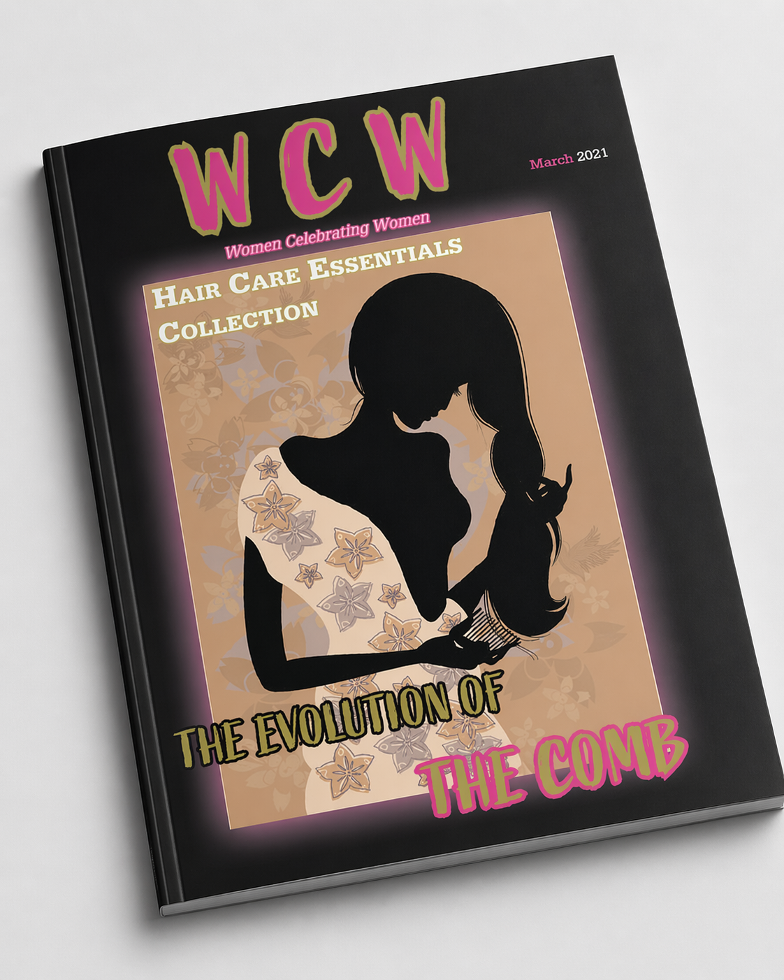
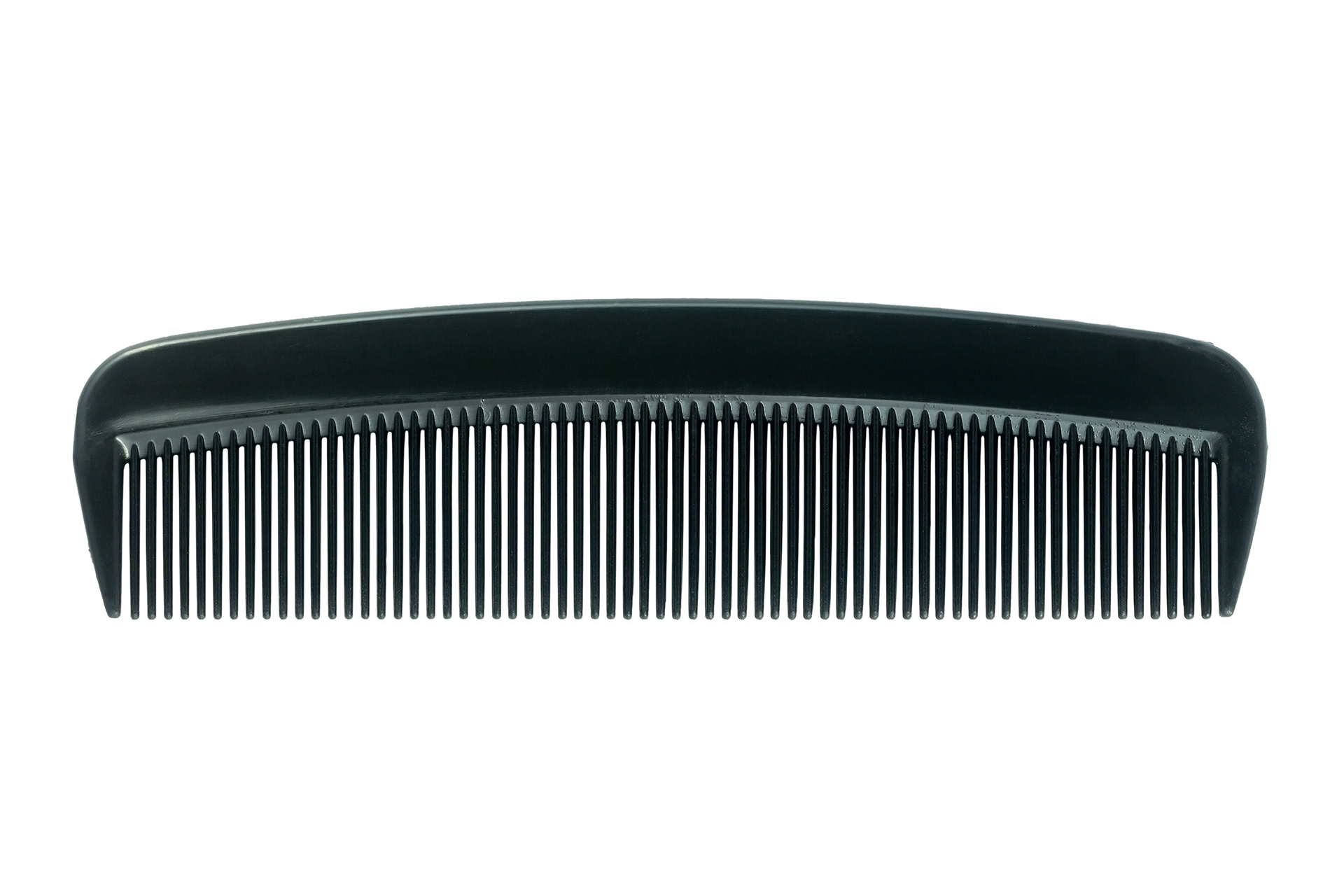
This project explores how a common everyday object—the comb—can be transformed into a compelling editorial narrative through design. The goal was to create a magazine experience that not only informs but also redefines how viewers perceive a familiar object by presenting it through the lens of history, culture, and creative reinterpretation.
Ideation & Research
This project explores how a common everyday object—the comb—can be transformed into a compelling editorial narrative through design. The goal was to create a magazine experience that not only informs but also redefines how viewers perceive a familiar object by presenting it through the lens of history, culture, and creative reinterpretation.
From this research, I explored how to visually communicate these ideas through editorial storytelling, using both text and imagery to build a cohesive narrative across the magazine.
Exploration (Sketching & Layout Development)
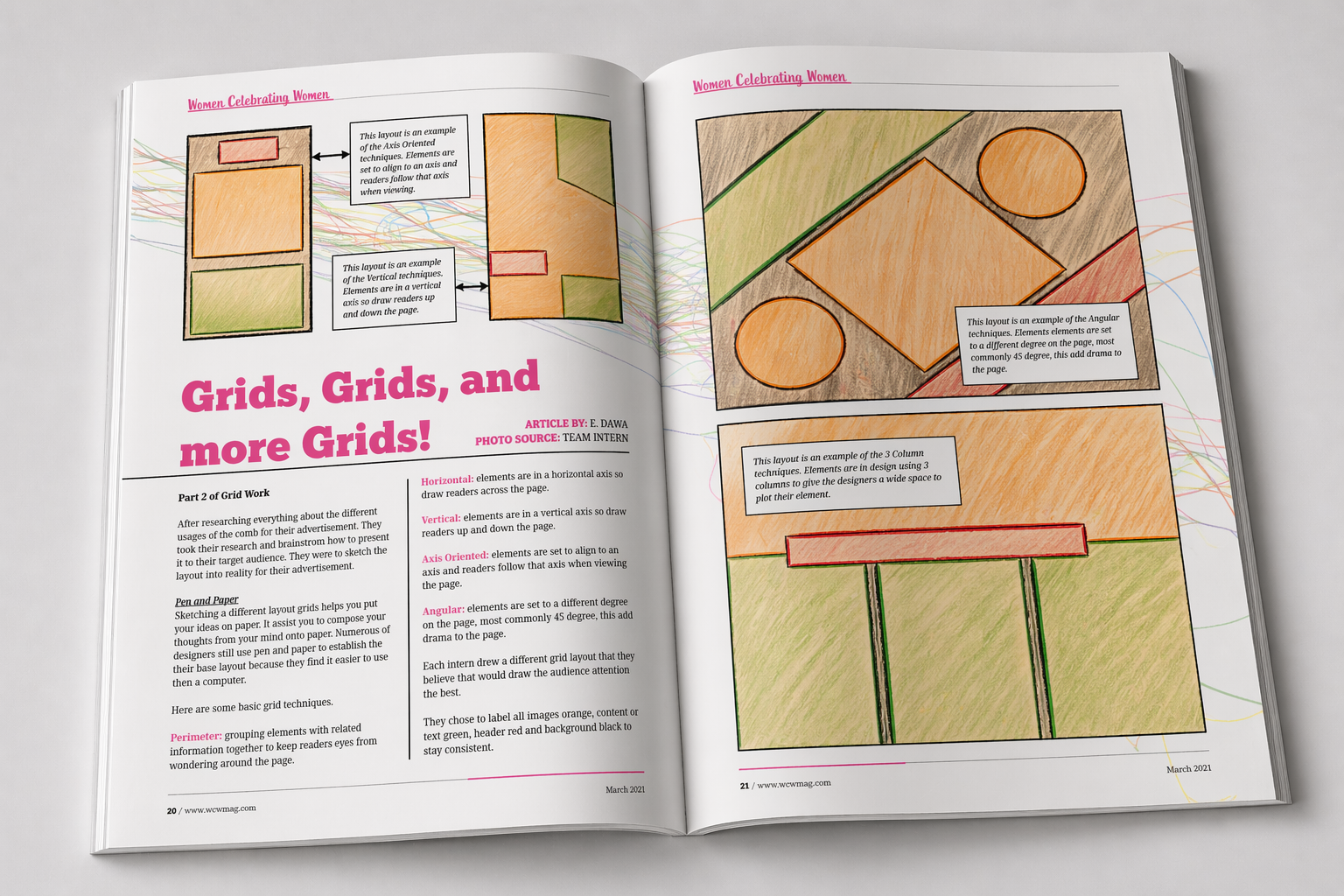
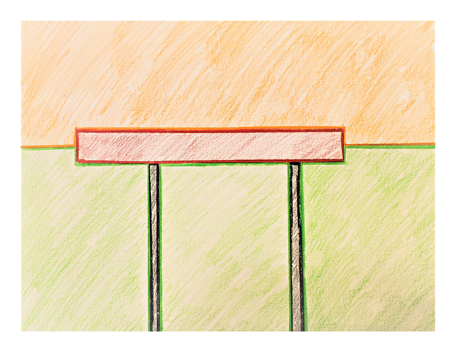
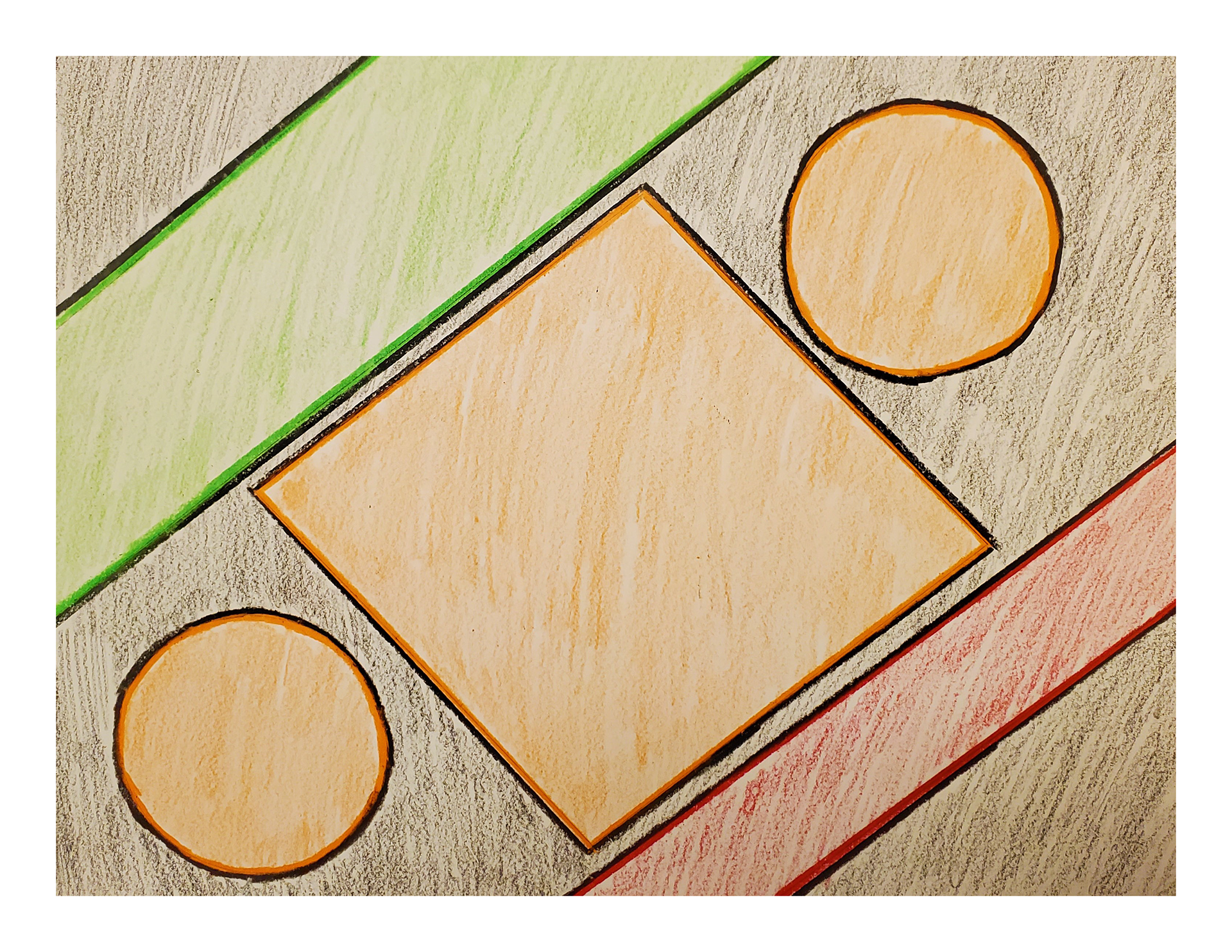
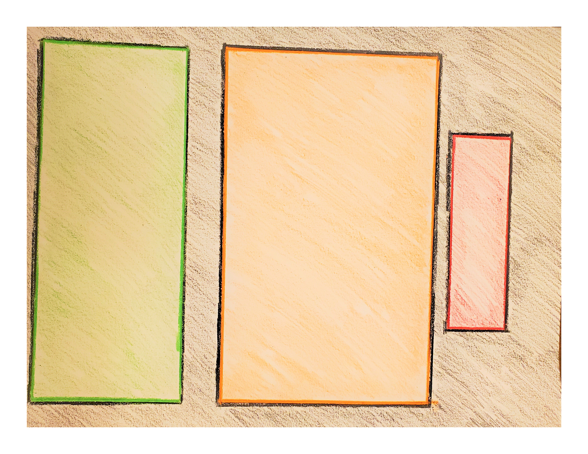
I began by sketching multiple grid layouts on paper to explore how information could be organized visually. These included:
- vertical grids
- horizontal grids
- angular layouts
- axis-oriented compositions
- multi-column structures
- horizontal grids
- angular layouts
- axis-oriented compositions
- multi-column structures
Each layout was tested to understand how it would guide the reader’s eye and support the flow of content. Sketching allowed me to quickly translate ideas from concept to structure before moving into digital design.
Grid System & Structure
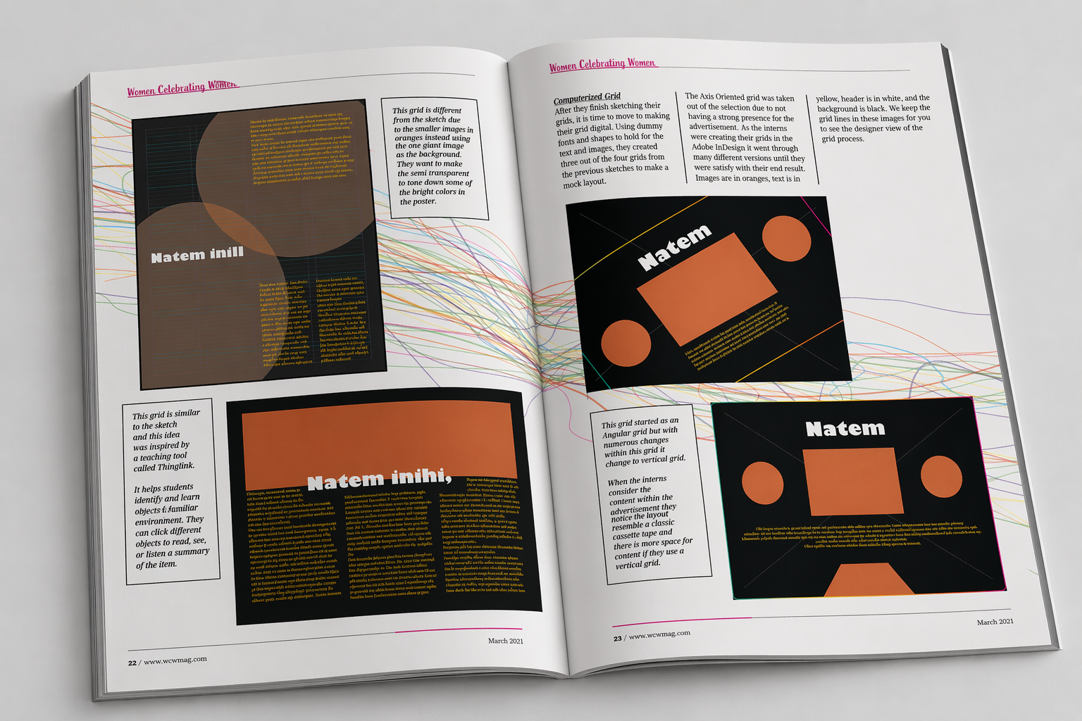
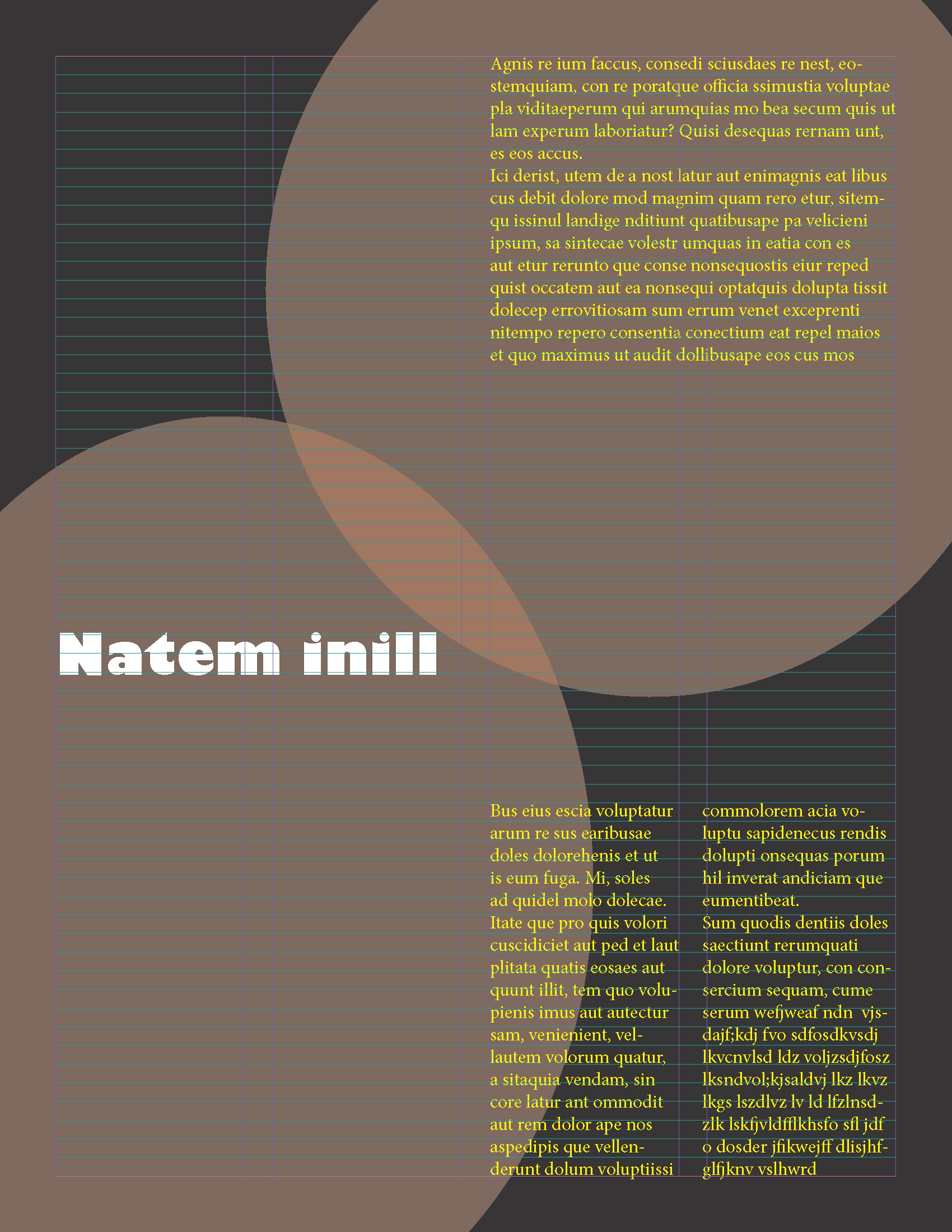
After exploring different layouts, I selected and refined grid systems that best supported readability and visual hierarchy. Some layouts were eliminated during this phase, such as the axis-oriented grid, because it did not create a strong enough visual impact for the content.
The final layouts focused on:
- clear hierarchy
- balanced composition
- strong alignment
- intentional movement across spreads
- balanced composition
- strong alignment
- intentional movement across spreads
This stage emphasized how grid systems act as the foundation for editorial design.
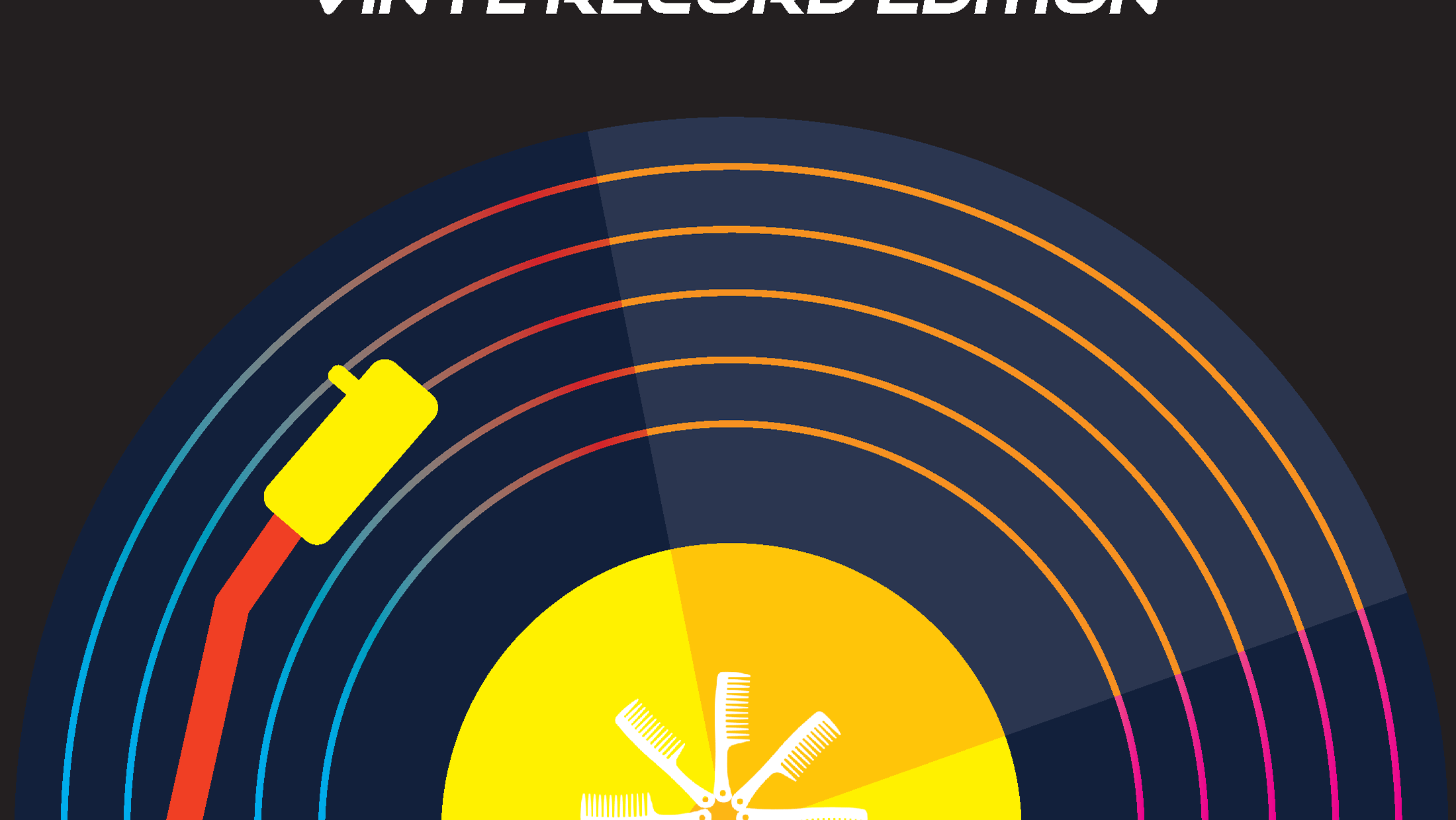
Design Decisions (Typography, Color & Theme)
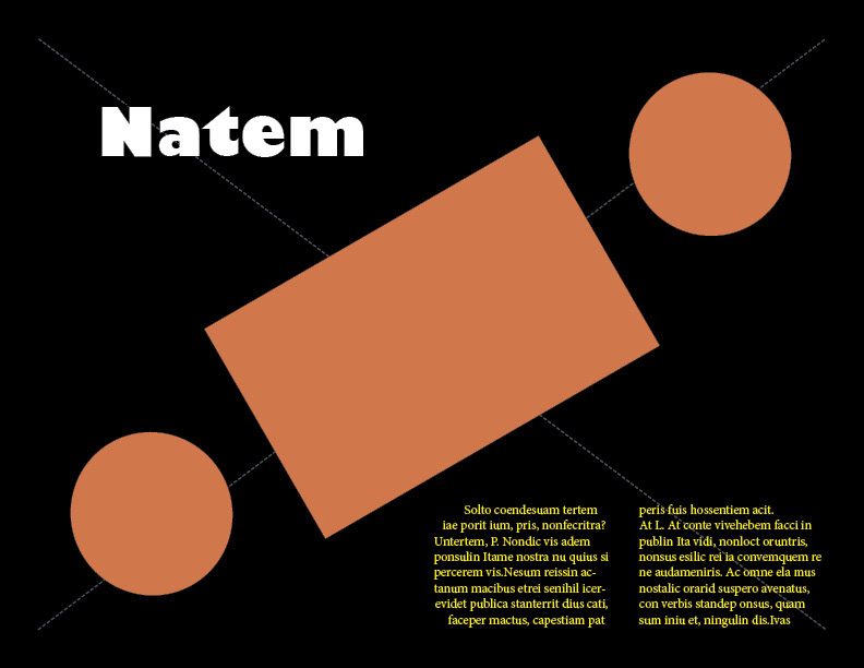
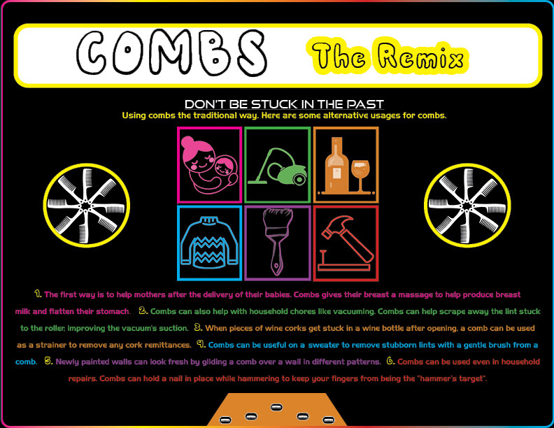
The final direction was inspired by an 80s remix concept, reimagining the comb in a bold, modern way.
Key design choices included:
- Vertical grid layout inspired by cassette tape structure
- Typography mix: bold retro fonts paired with modern typefaces
- Color palette: neon and high-contrast tones to reflect 80s visual culture
- Visual hierarchy: clear distinction between headers, subheaders, and body text
- Typography mix: bold retro fonts paired with modern typefaces
- Color palette: neon and high-contrast tones to reflect 80s visual culture
- Visual hierarchy: clear distinction between headers, subheaders, and body text
Text and color were intentionally used to convey tone and energy, illustrating how design elements influence how content is perceived.
Digital Development
The layouts were then translated into Adobe InDesign, where I created multiple iterations of each spread. Using placeholder text and shapes, I tested different compositions and refined spacing, alignment, and hierarchy until reaching a final design.
This iterative process allowed the design to evolve from rough concepts into a cohesive editorial piece.
------------------------------------------------------
Final Outcome
The final magazine combines research, storytelling, and design into a cohesive publication that presents the comb as both a functional object and a cultural symbol. Through layout, typography, and visual structure, the magazine creates an engaging and informative reading experience.
reflection
This project strengthened my understanding of editorial design, particularly how grid systems, typography, and layout work together to guide the reader’s experience. It also showed me how design can transform simple topics into engaging visual narratives.