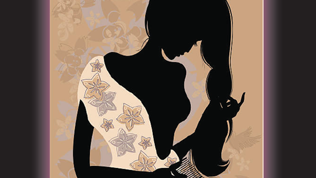
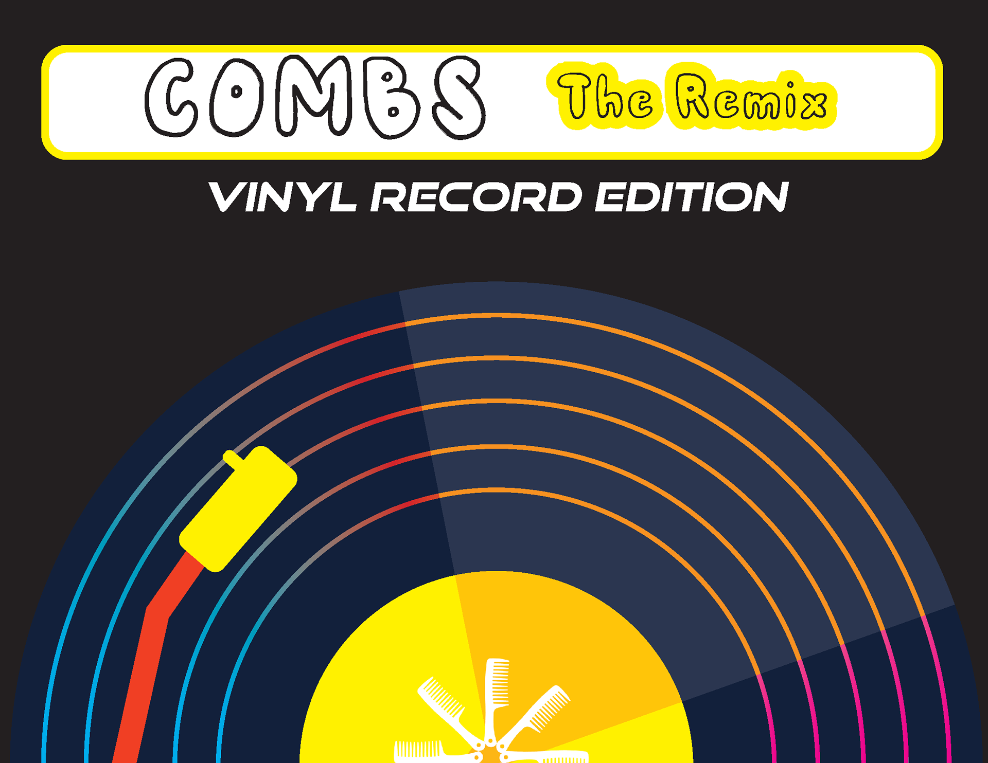
A conceptual poster that transforms the comb into a vinyl-inspired visual system, reimagining a familiar object through color, mood, and composition.
Project Concept
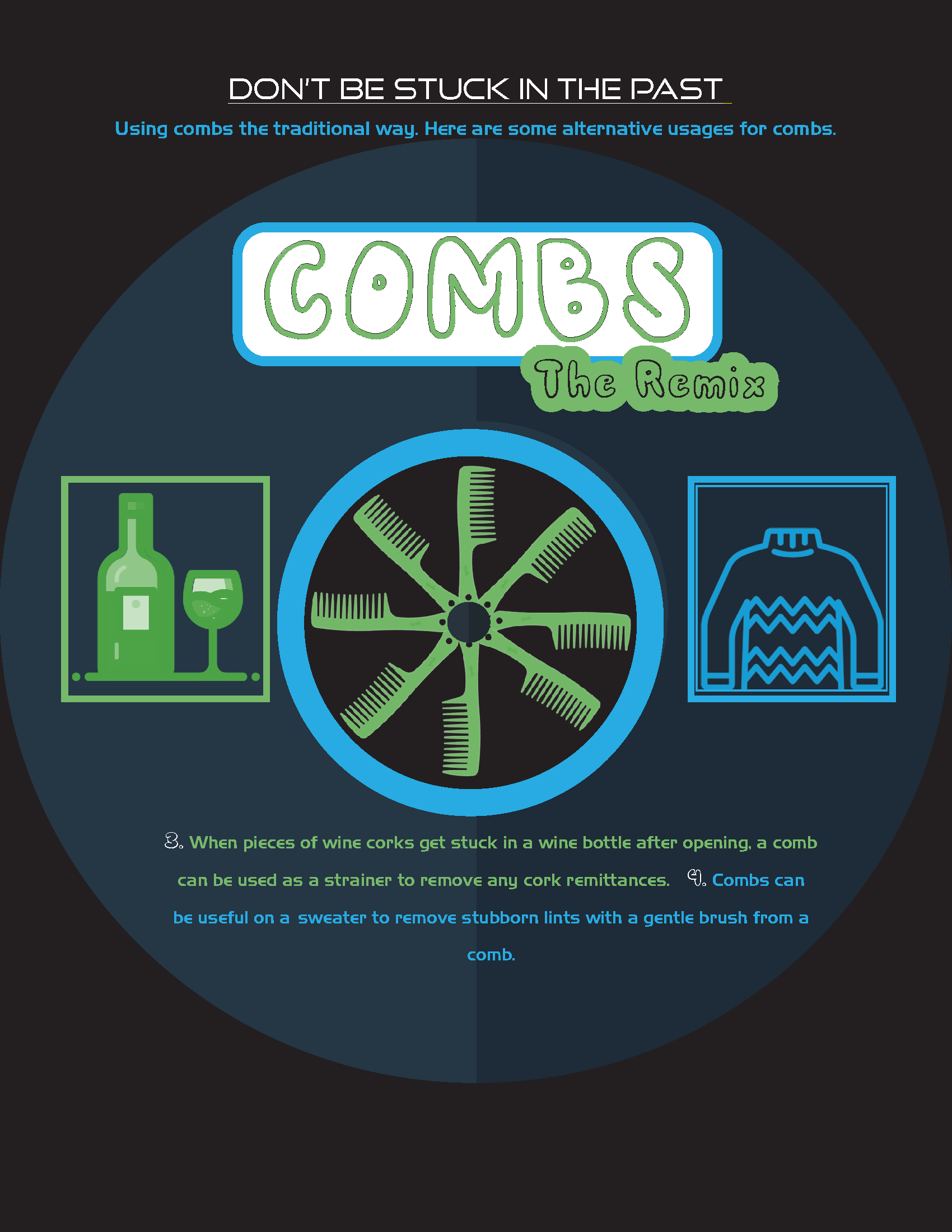
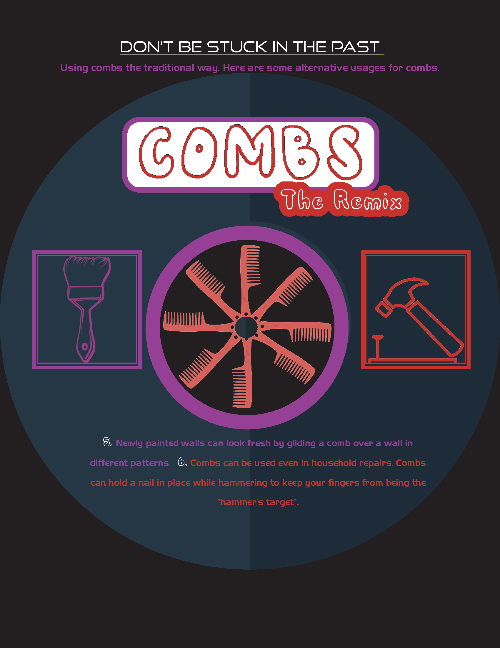
This project reimagines the comb through a music-inspired transformation, evolving the object from its traditional use into a vinyl record concept. The goal was to connect the idea of a comb to remix culture, in which something familiar is reinterpreted as something new and expressive.
The phrase “Don’t Be Stuck in the Past” reinforces this idea by encouraging viewers to see the comb beyond its original function.
Inspiration & Direction
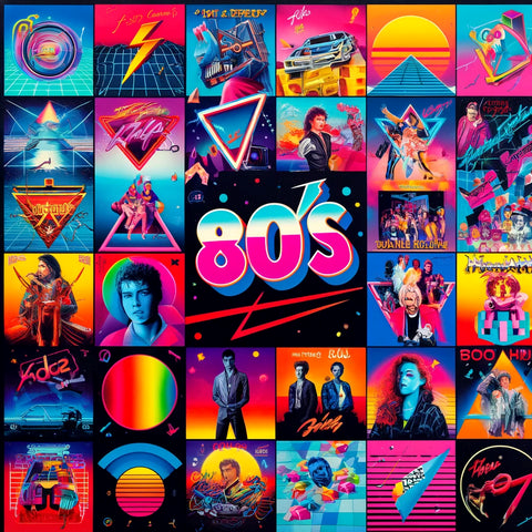
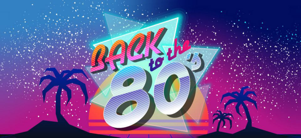
The design direction was heavily influenced by 1980s visual culture, particularly:
- vinyl records
- cassette tapes
- bold retro typography
- neon and high-contrast color palettes
- cassette tapes
- bold retro typography
- neon and high-contrast color palettes
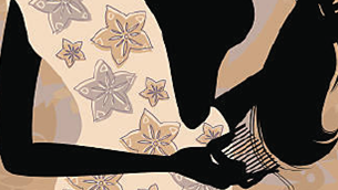
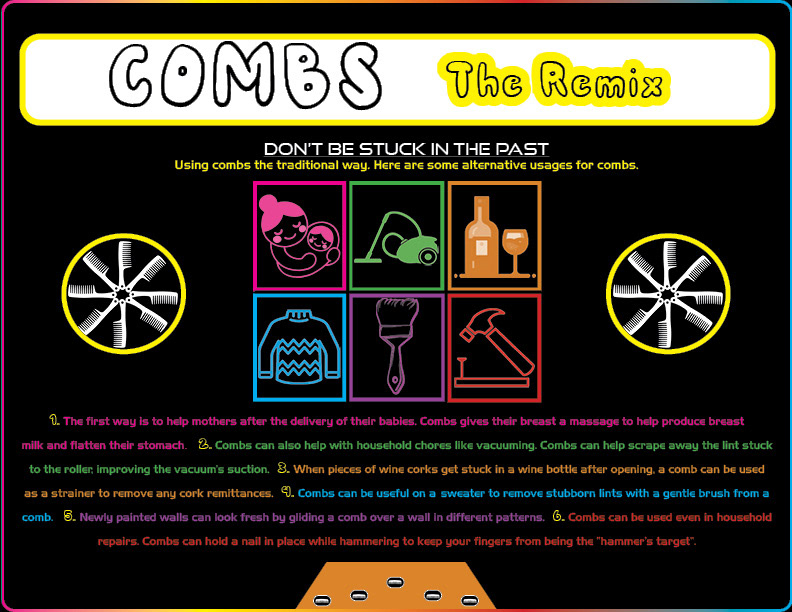
The comb itself was transformed into a record-like circular form, visually linking the object to music and remix culture. This allowed the design to feel both nostalgic and modern.
samples of 80s music
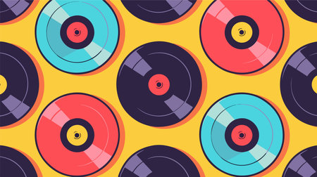
vinyl records icons of 1980s
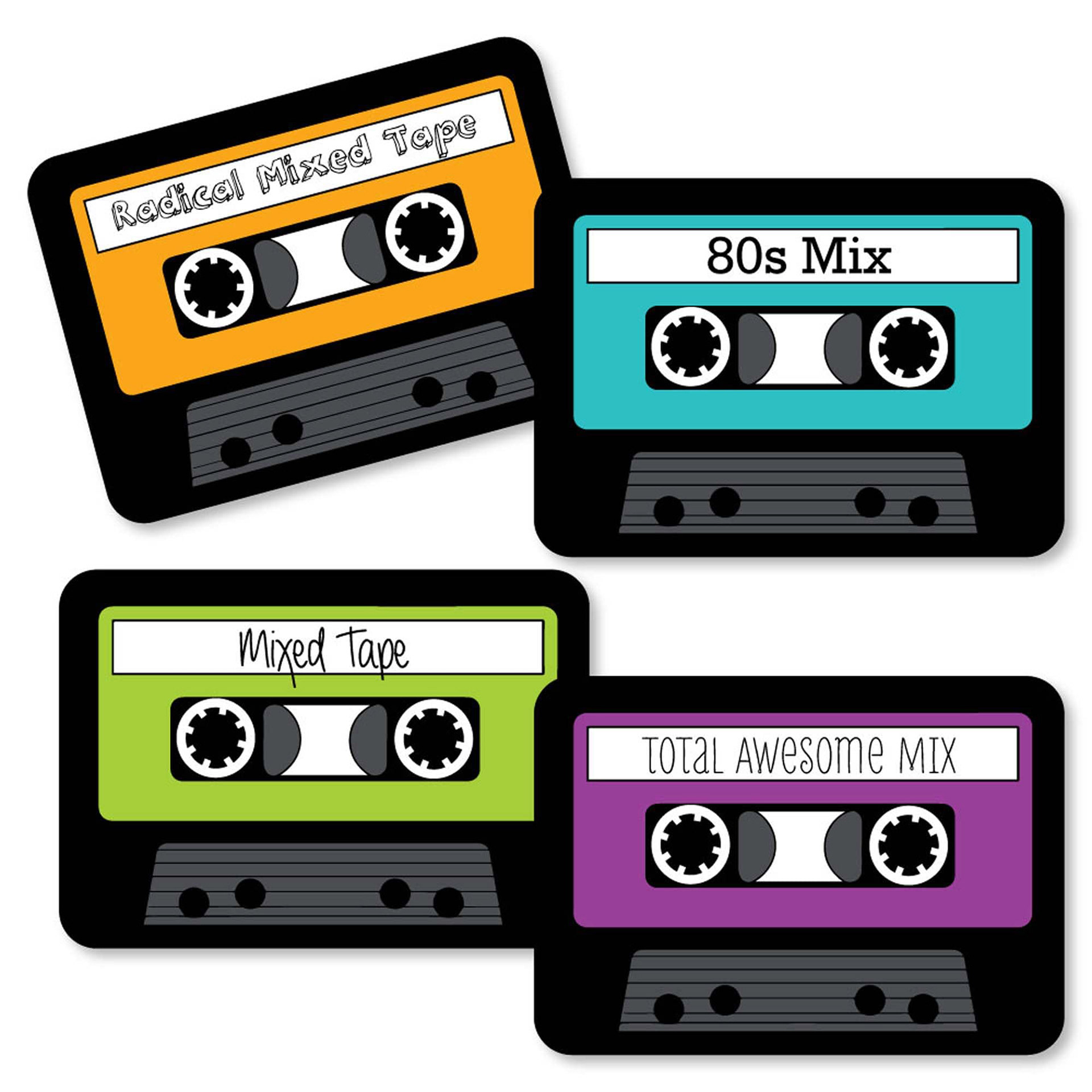
cassette tapes icons of 1980s
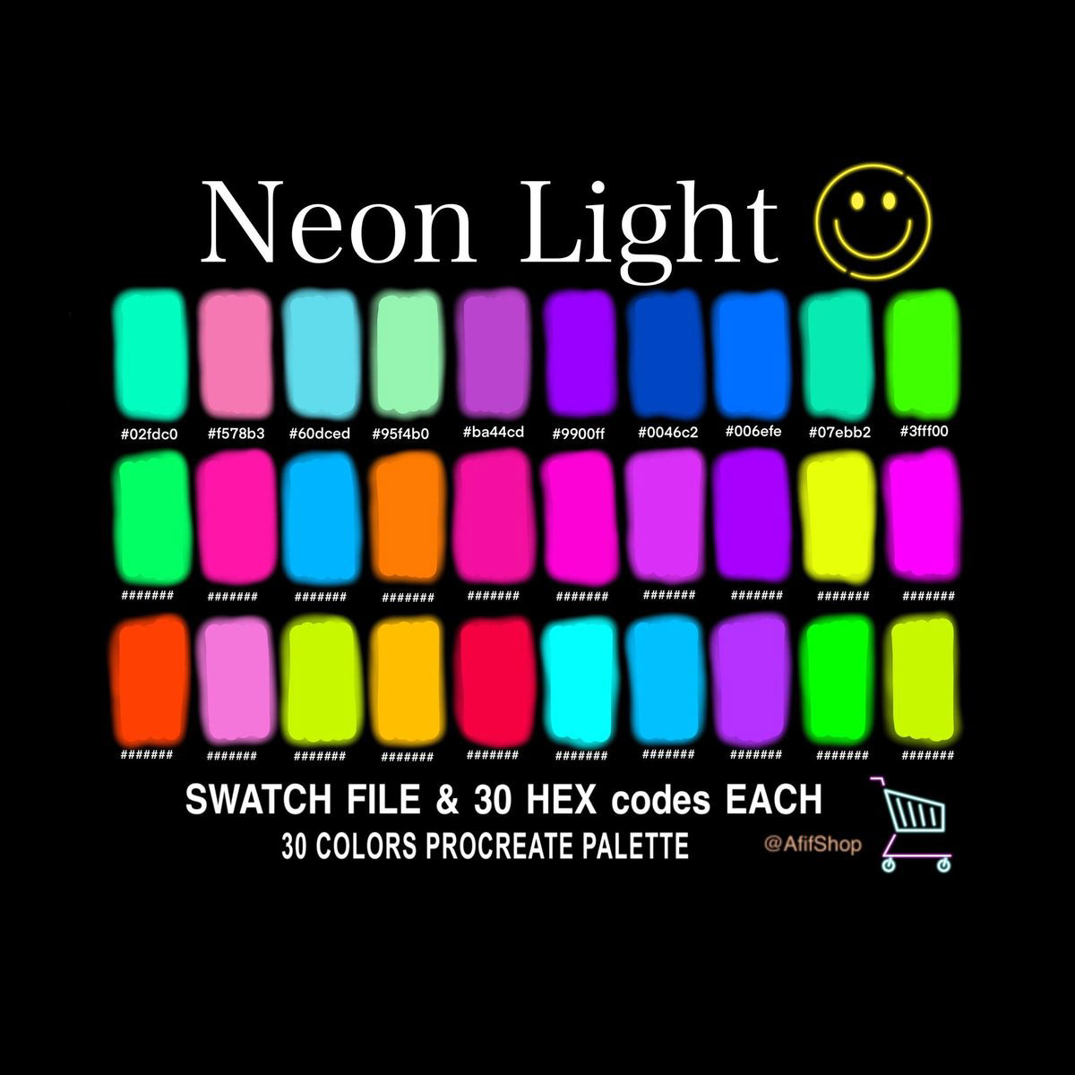
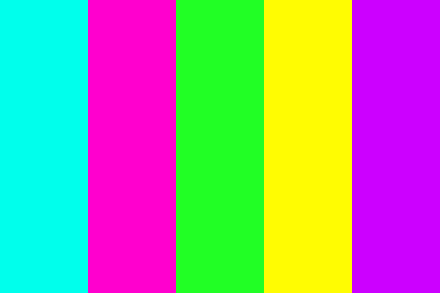
neon and high-contrast color palettes
neon and high-contrast color palettes
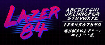
bold retro typography
bold retro typography
bold retro typography
Exploration (Color & Mood)
A major part of this project was exploring how color creates mood and audience connection.
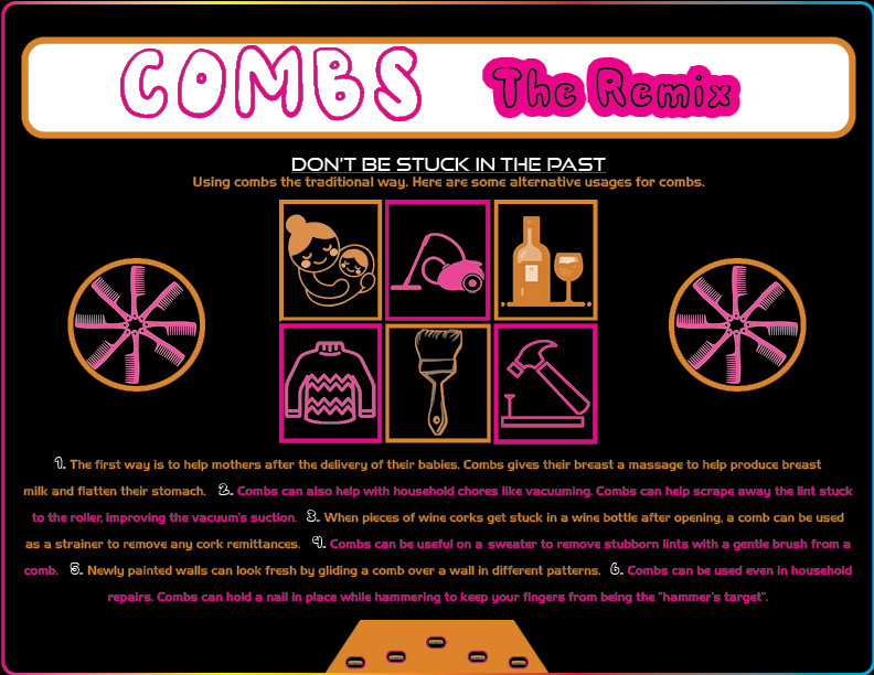
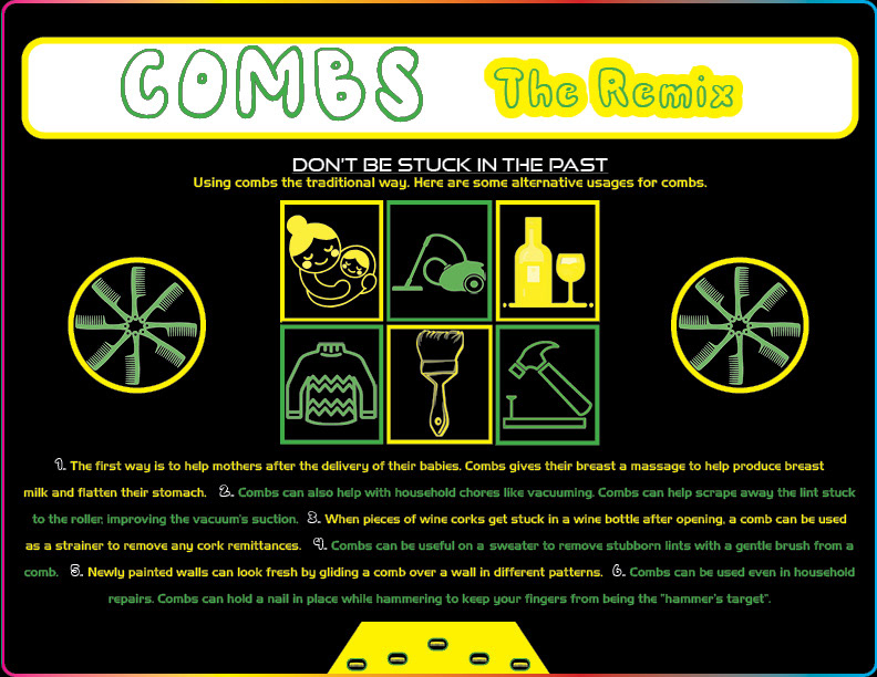
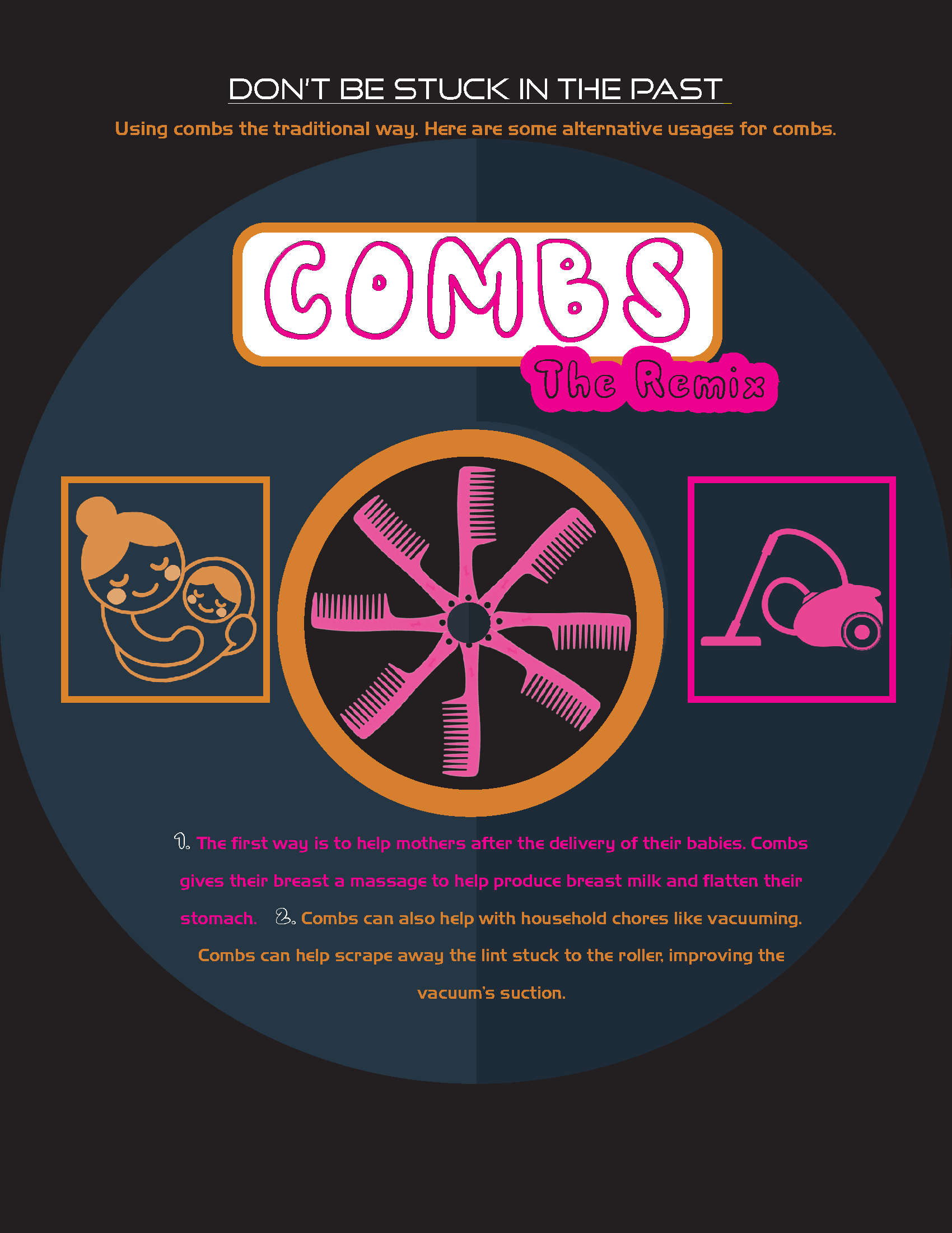
I developed three distinct color variations, each targeting a different emotional response:
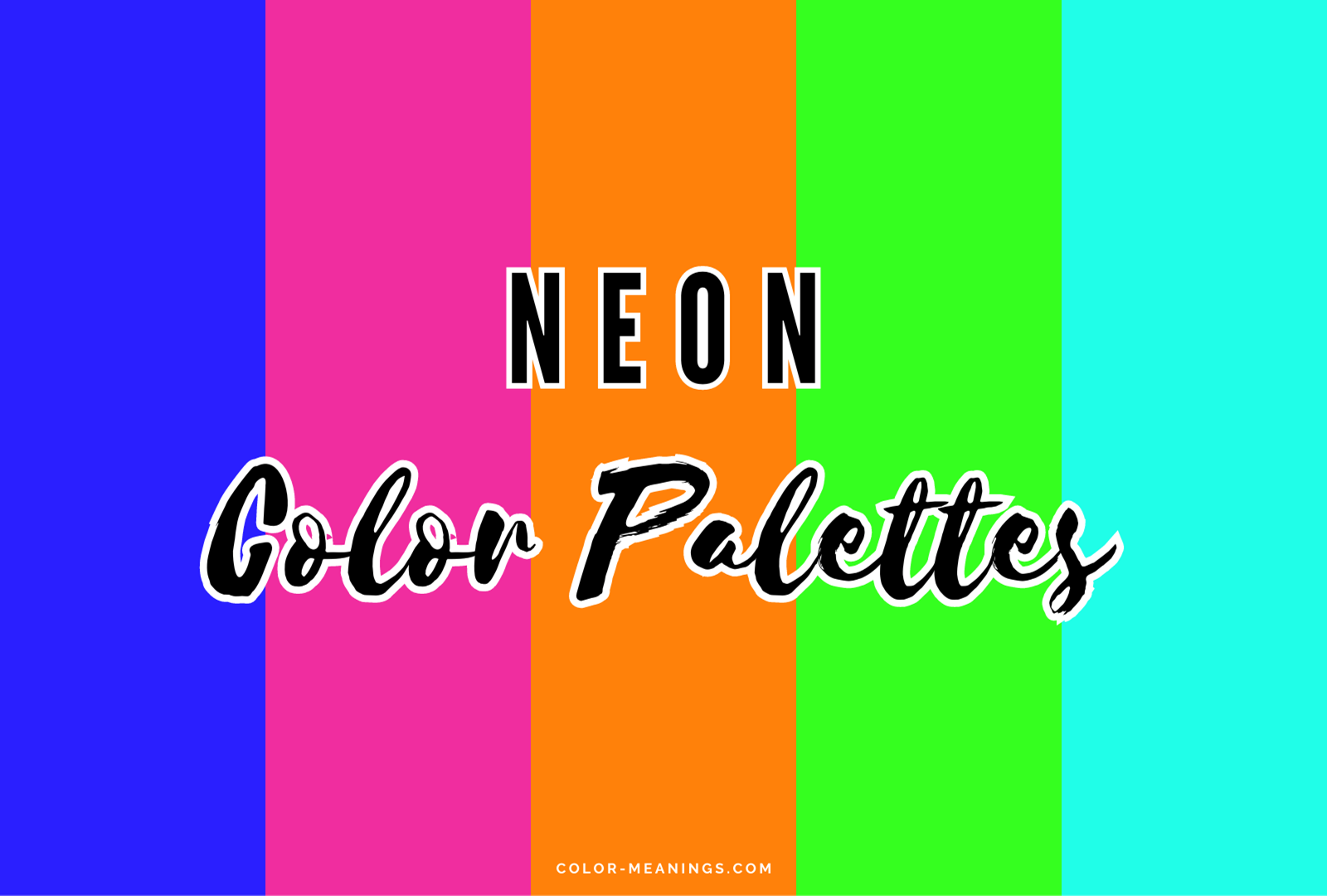
Neon Color Scheme → bright, energetic, and attention-grabbing
Feminine Color Scheme → softer tones designed for a women’s magazine audience
Classic 80s Palette → bold greens and yellows inspired by the decade
Feminine Color Scheme → softer tones designed for a women’s magazine audience
Classic 80s Palette → bold greens and yellows inspired by the decade
Each version used the same layout but created a completely different visual experience through color alone.
Design Decisions
Several key design choices helped bring the concept to life:
Vinyl record composition → circular layout centered around the comb form
Icon-based storytelling → surrounding visuals show alternative uses of the comb
Typography → playful, retro-inspired fonts to reflect 80s design trends
Contrast and hierarchy → bold colors against a dark background to guide attention
Repetition of form → circular shapes reinforce the vinyl theme
Icon-based storytelling → surrounding visuals show alternative uses of the comb
Typography → playful, retro-inspired fonts to reflect 80s design trends
Contrast and hierarchy → bold colors against a dark background to guide attention
Repetition of form → circular shapes reinforce the vinyl theme
These decisions helped unify the concept and visually communicate transformation and remixing.
------------------------------------------------------
Message & Visual Communication
The poster communicates that everyday objects can have multiple uses and meanings, using design to shift perception.
By combining:
- bold visuals
- structured layout
- playful typography
The design turns an ordinary object into something engaging, informative, and visually dynamic.
Final Outcome
The final poster presents the comb as both a functional object and a creative concept, blending editorial design with visual storytelling. The vinyl-inspired layout creates a strong focal point while supporting the message through color, icons, and composition.
BEFORE
after
reflection
This project strengthened my understanding of how color, concept, and composition work together to influence perception. It also allowed me to explore how design can transform a simple object into a more engaging and meaningful visual experience.